The real climategate

Climategate is all the rage at the moment. What interests me about this episode is not the integrity of certain scientists, or science in general, nor the culture of academia, and certainly not the evidence of climate change. For me, the real climategate is the woeful state of statistical education. Let me explain.
Here is the infamous email: (via Nathan Silver, with my highlights)
From: Phil Jones
To: ray bradley ,mann@[snipped], mhughes@
[snipped]
Subject: Diagram for WMO Statement
Date: Tue, 16 Nov 1999 13:31:15 +0000
Cc: k.briffa@[snipped],t.osborn@[snipped]
Dear Ray, Mike and Malcolm,
Once Tim’s got a diagram here we’ll send that either later
today or first thing tomorrow. I’ve just completed Mike’s Nature
trick of adding in the real temps to each series for the last 20
years (ie from 1981 onwards) amd [sic] from1961 for Keith’s to
hide the decline. Mike’s series got the annual land and marine
values while the other two got April-Sept for NH land N of 20N.
The latter two are real for 1999, while the estimate for 1999
for NH combined is +0.44C wrt 61-90. The Global estimate for
1999 with data through Oct is +0.35C cf. 0.57 for 1998.
Thanks for the comments, Ray.
Cheers, Phil
What concerns me is Phil Jones' describing what he did as a "trick" to "hide the decline". He apparently thought that he was doing something shameful. But when is it shameful to extend the plot of a time series so as to display the long-term trend, and not be misled for short-term fluctuations? This is providing statistical context to the data being examined. Lots of people are condemning this as a willful act to mislead the public but if they have some statistical literacy, they will understand that finding the appropriate time scale to look at the data is one of the most important tasks of analyzing time series data. It's a problem when even prominent scientists do not comprehend why they should be doing this.
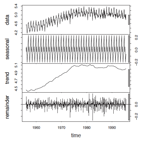
I have always wondered why in climatology as well as in economics, we rarely see decomposed time-series plots (at least not in the public's eye).
On the right, I found on-line a plot of a decomposition of beer sales that separates out seasonality, trend and other parts of a time series. The original data is shown up top. In practice, newspapers and blogs give us such plots all the time when they should show us the third plot down (the trend with the seasonal factor removed), unless the story is about seasonality.
Note to self: should include basic time-series decomposition in the intro stats syllabus; much too important a topic to leave to a second course.


