The return on effort in data graphics
The higher the effort, the greater should be its reward
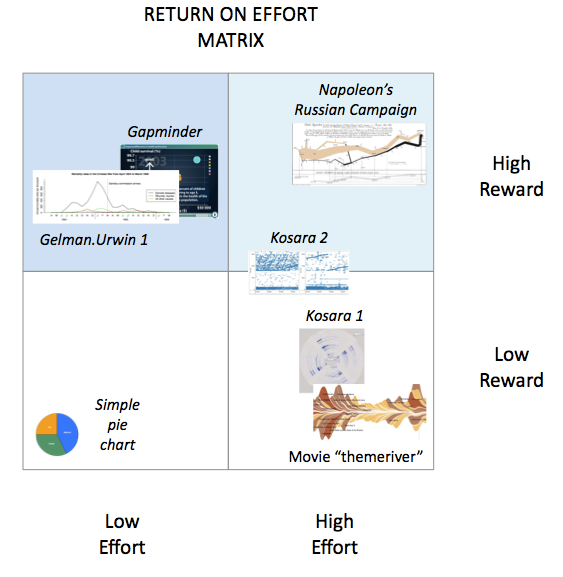
I contributed the following post to the Statistics Forum. They are having a discussion comparing information visualization and statistical graphics. I use the following matrix to classify charts in terms of how much work they make readers do, and how much value readers get out of doing said work.

To read the rest of it, click here.


