The smell of pie charts
An attempt to deodorize
So many experts have been dumping on pie charts for so long that they have acquired a stench. People still want to make pie charts but they're worried about rattling the experts. So they put on lipstick.
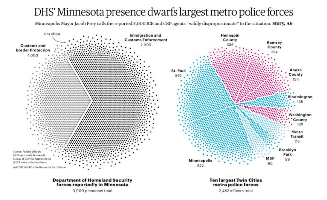
Reader Kirsten P. sent me this graphic by Minneapolis Star Tribune, illustrating the disproportionate forces the Federal Government has sent to a metropolitan region of the country. The graphic accompanies an article which gives further background (link).
At first sight, this looks like a new kind of chart: part dot plot and part pie chart.
Not really. You're looking at two side-by-side pie charts. Nothing more, nothing less. The dots play no role other than to disguise these pie charts. A text note even tells readers that each dot represents one officer. I'll take a wild guess: no one is out there counting dots.
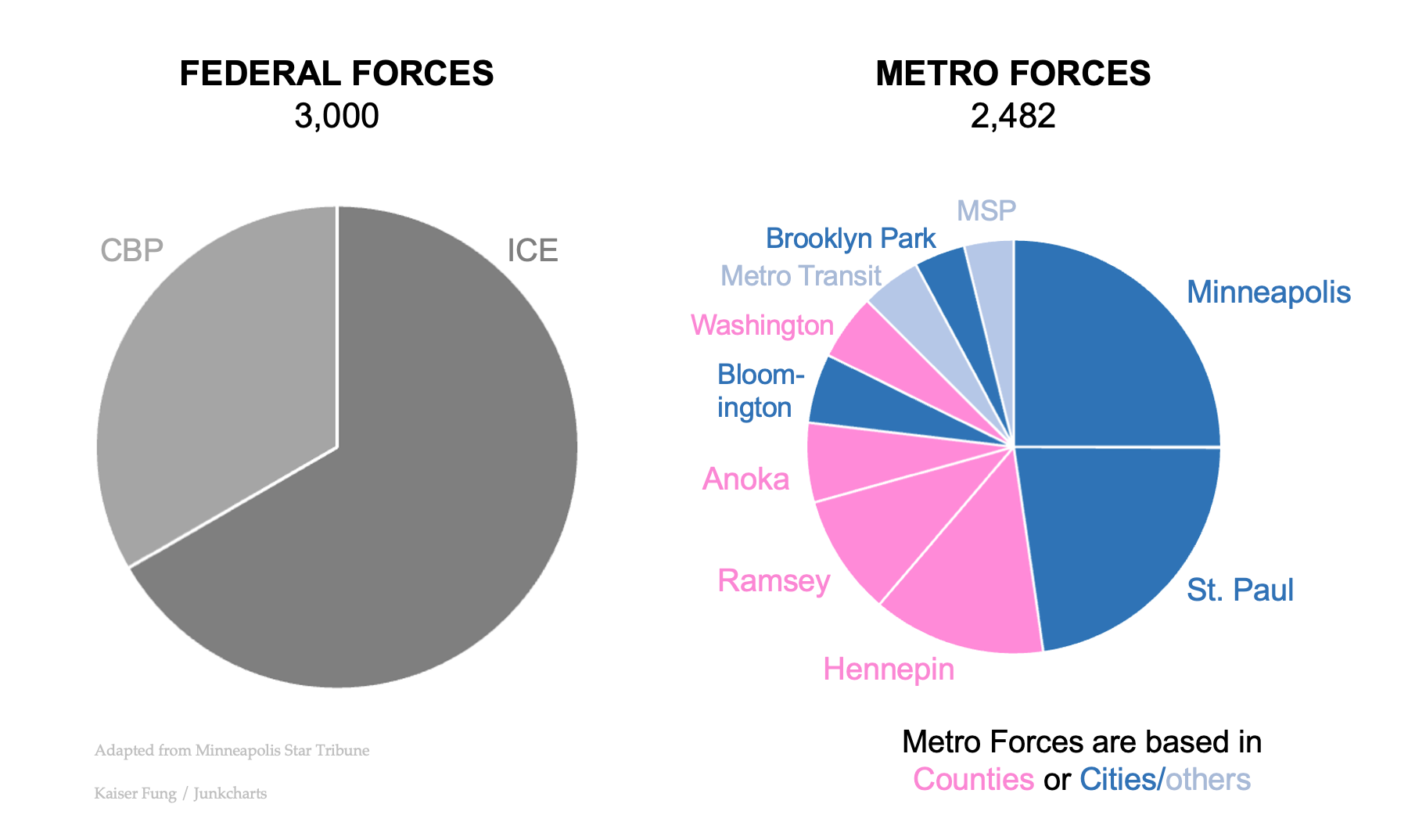
Here I strip away the dots:
The pie on the left shows federal forces in the Twin Cities. (The original label says Minnesota for an unknown reason but in the article, they wrote "Homeland Security Secretary Kristi Noem told Fox News on Jan. 6 that her agency sent 2,000 Immigration and Customs Enforcement agents to the Twin Cities" which referred to Twin Cities.)
The pie on the right depicts the sizes of the top 10 metro police forces within the Twin Cities area. The point is that the two pies are roughly the same size (the right pie should be about 1/6th smaller.) [Maybe there is a bigger point: how the Republican trifecta of president, Congress and Supreme Court is imposing "big government", and in particular, federal authority over states, both supposedly misguided Democratic policies. Confusing, no?]
Inside the chart is a puzzle. What do the colors on the right signify?
I suppose Minnesotans will ace this test but as someone not from there, it took me a while to figure this out.
My first guess is red for Republican and blue for Democrat. This doesn't feel right as there shouldn't be many Republican counties in a metropolitan area. (And indeed, this guess does not pan out.)
This puzzle unlocks when I noticed the label "MSP": it is out of place because M = Minneapolis and SP = St Paul, each of which has its own slice of the pie. MSP is also the acronym for the airport, and the airport probably has its own police force.
Thus, the red slices are police forces belonging to counties while the blue slices are entities other than counties. Squinting harder, one can differentiate two shades of blue. MSP and Metro Transit are the lighter blue while the other blue show police forces associated with cities.
The reader's attention is drawn to the divisions within each pie when the article's story is about the difference in the sizes of the two pies.
Here's a version that points the readers directly at the story: