The story on international students coming to the U.S.
How to visualize complex datasets
The New York Times noted the drop in international students arriving in the U.S. in 2025 (link; paywall). As the following charts show, the schools have nearly recovered from the Covid-19 related dip but in the last year or so, the trend has reversed, probably due to the current hostility toward foreign-born persons.
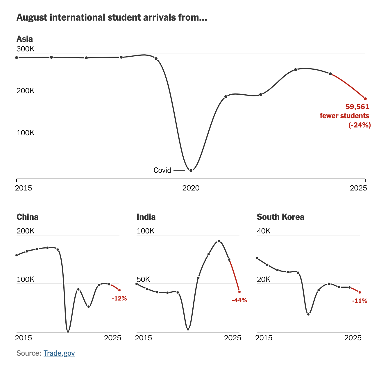
(Note that each chart above has a different scale.)
These line charts are incredibly ugly because of the Covid-19 "shock."
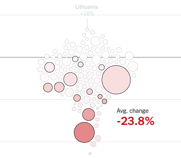
Later in the article, the focus shifts to the change from 2024 to 2025. The time dimension is thus removed. They choose a bag of bubbles design:
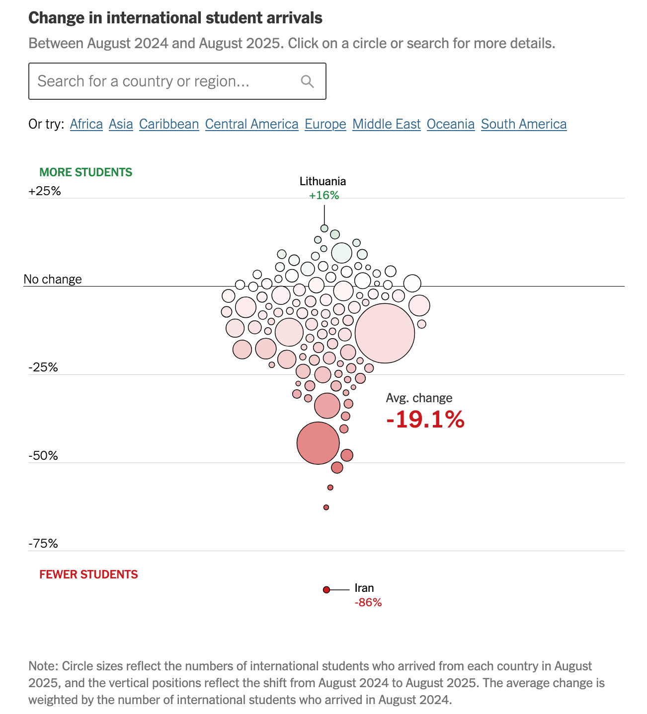
Some readers will find this design engaging. You positively must play with the chart in order to learn something about the data. Which bubble represents which country? Is the declining trend affecting all regions?
Unlike the line charts above, if the reader is interested in the year-on-year change in student arrivals, this bubble chart gives out that information directly.
The size of the bubbles shows the 2025 data. This signals the relative importance of the bubbles. The main takeaway is that the erosion was widespread: most circles sit below the axis of no change.
The aggregate drop in arrivals was almost 20%. This value is printed on the chart as an annotation. Without the text, it would be impossible to figure it out. You'd have to do an average of the individual decline rates, using the relative bubble sizes as weights.
Let's switch the perspective, and make a chart that gives readers some high-level takeaways.
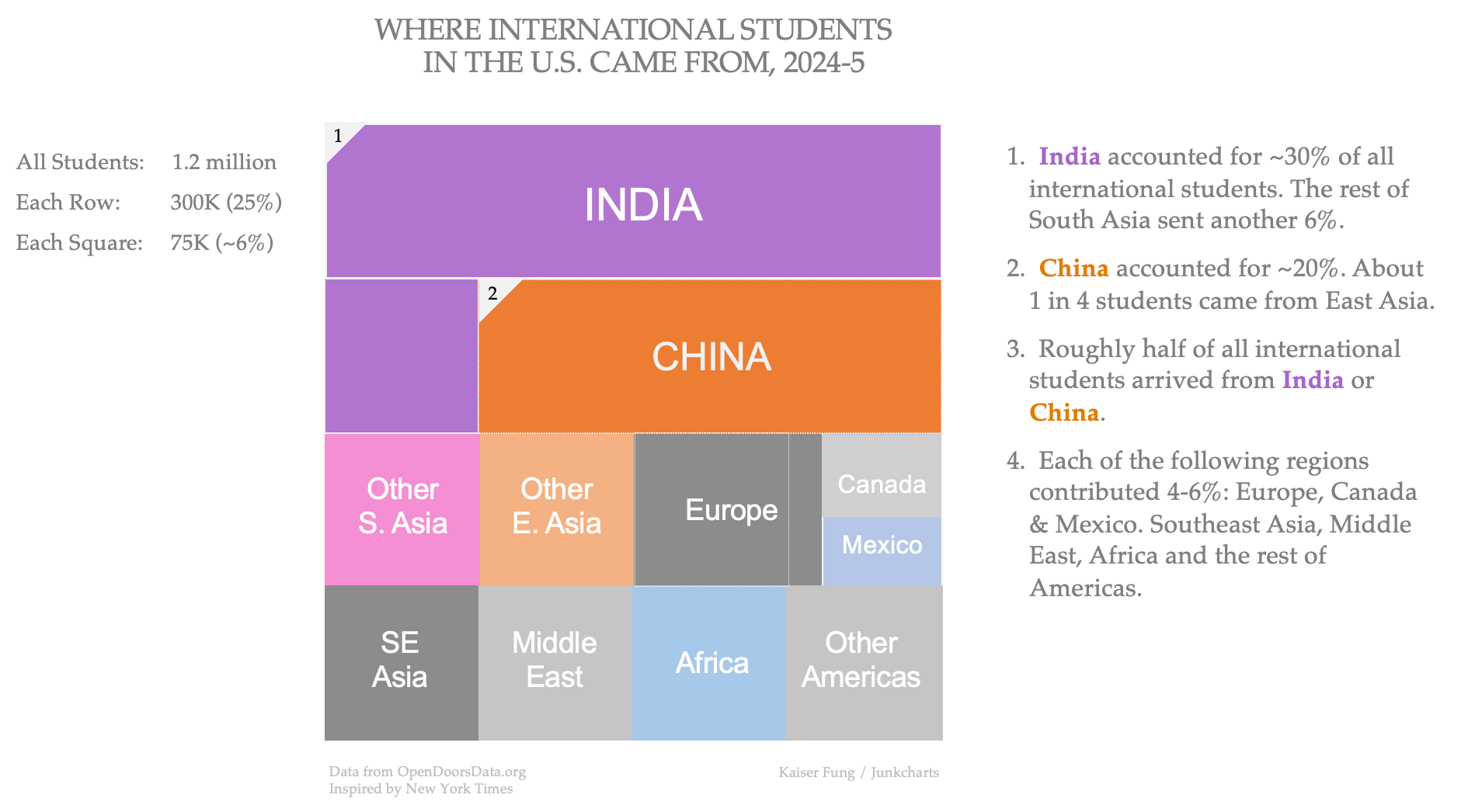
In this chart, the outer square displays all 1.2 million international students in 2024-5. The population of all students is divided into four rows, each containing ~300K students.
From this, you can see that India and China together account for half of the total. India is the top source of international students, comprising ~30% of the total (25% + 25%/4 =31%).
Each row is subdivided into four parts, so each "cell" covers about 75,000 students, ~6% of the total.
The bottom two rows show a classification of countries into eight regions with roughly equal contributions: South Asia (excl. India), East Asia (excl. China), Europe, Canada+Mexico, Southeast Asia, Middle East, Africa and Americas (excl. Canada+Mexico).
As an extra, I also show the relative sizes of Canada vs. Mexico.
The challenge of visualizing complex datasets like this one is to pick a problem of manageable size, and then to distill the stories contained in the data.
(Note that I obtained data from OpenDoorsData.org, which is a different source than what the Times used. As a result, I have full data on Canada and Mexico.)