The trouble with maps
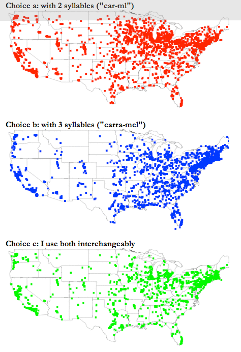
Todd B. pointed us here. These are maps that supposedly show the distribution of respondents for each answer choice in a survey exploring accents in different parts of the country. The full set of maps for every question can be found here.
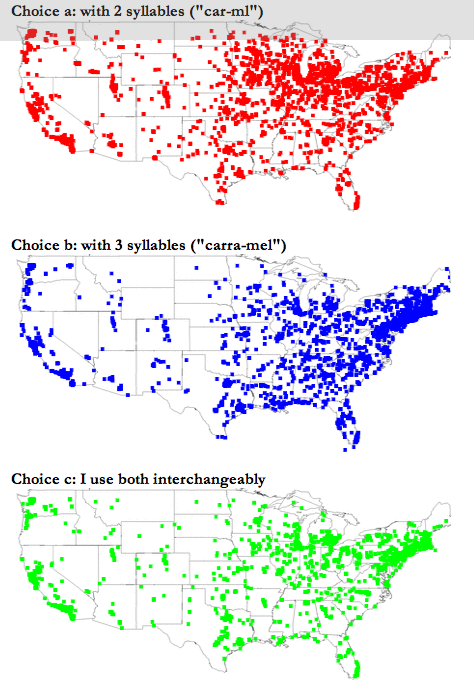
Amusingly, the researchers also provided a map of "all respondents". (I won't ask how the proportions of respondents were reduced to binary output to produce the above maps.)

Here is Todd to lead off the discussion:
Just because you put data on a map doesn't make it effective. Check out these mapped responses that either tell us that there is no difference in dialects or fails to illustrate differences effectively.
Reference: "Dialect Survey", University of Wisconsin-Madison.