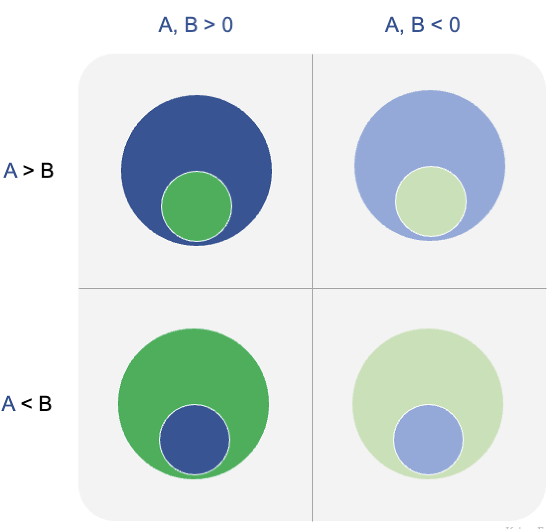
Using disaggregation in dataviz
Disaggregating data can be very useful when making charts
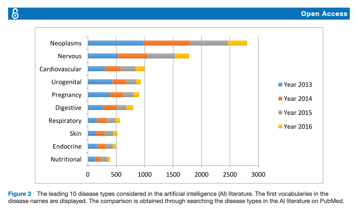
This chart appears in a journal article on the use of AI (artificial intelligence) in healthcare (link).

It's a stacked bar chart in which each bar is subdivided into four segments. The authors are interested in the relative frequency of research using AI by disease type. The chart only shows the top 10 disease types.
What is unusual is that the subdivisions are years. So these authors revealed four years of journal articles, and while the overall ranking of the disease types is by the aggregated four-year total counts, each total count has been disaggregated by color so readers can also see the annual counts.
***
A slight rearrangement yields the following:

Most readers will only care about the left chart showing the total counts. More invested readers may consider the colored charts that show annual totals. These are arranged so that the annual counts are easily read and compared.
***
One annoying aspect of this type of presentation is that in almost all cases, the top 10 types in aggregate will not be the top 10 types by individual year. In some of those years, I expect that the 10 types shown do not include all of the top 10 types for a particular year.