Visual analogies

Many a startling faux pas in graphics start with the desire to utilize visual analogies: the recent shopping mall chart is a good example. There is something inviting about making a chart about shopping malls look like a shopping mall, or a chart about breakfast foods look like a donut, and so on.
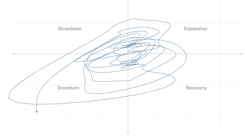
The New York Times (or maybe OECD) makes a chart about economic cycles look like, you guess it, cycles. Don't really have too much to say about this one - except these two points:
- Much of the validity of the chart depends on the theory behind it. Do the two variables being tracked (amount produced relative to trend; change in production in last 6 months) capture everything?
- The focus on generating cycles visually left out one of the most important dimension - that of time scale. For this chart to work, we would like to know not just where we are in the cycle but how much time we'd spend at each point in the cycle. The interactive charts (graphs 4, 5, 6, 7) show us that the cycles are traversed not at constant speed. A proper rendering of this data needs to play up the time scale.
If you have ideas of how to improve this, feel free to comment.
Reference: "Turning a corner?", New York Times, July 2 2009.


