Visualizing extremes
Nice NYT chart showing weather extremes
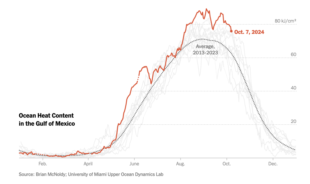
The New York Times published this chart to illustrate the extreme ocean heat driving the formation of hurricane Milton (link):

The chart expertly shows layers of details.
The red line tracks the current year's data on ocean heat content up to yesterday.
Meaning is added through the gray line that shows the average trajectory of the past decade. With the addition of this average line, we can readily see how different the current year's data is from the past. In particular, we see that the current season can be roughly divided into three parts: from May to mid June, and also from August to October, the ocean heat this year was quite a bit higher than the 10-year average, whereas from mid June to August, it was just above average.
Even more meaning is added when all the individual trajectories from the last decade are shown (in light gray lines). With this addition, we can readily learn how extreme is this year's data. For the post-August period, it's clear that the Gulf of Mexico is the hottest it's been in the past decade. Also, this extreme is not too far from the previous extreme. On the other hand, the extreme in late May-early June is rather more scary.