Where a scatter plot fails
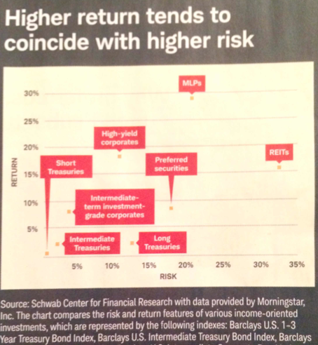
Found this chart in the magazine that Charles Schwab sends to customers:

When there are two variables, and their correlation is of interest, a scatter plot is usually recommended. But not here!
The text labels completely dominate this chart and the designer tried very hard to place them but a careful look reveals that some boxes are placed above the dots while others are placed to their right and the dot for "Short Treasuries" holds refuge quite a while away from the dot. This means the locations of the text boxes do not substitute for the dots.
***
Here is a different view of this data:

I am using a bumps-style chart, which allows the labels to be written horizontally outside the canvass. Instead of all categories plotted on the same chart, I use a small multiples setup to differentiate three types of risk-return relationships.


