Why is this chart confusing?
A confusing chart on Broadway shows
Significance Magazine has a fascinating article about the success rate of Broadway productions. The authors conclude that Broadway investors have about 20-25% chance of recouping their original investment. (Recoupment means breakeven, different from making tons of profits!)
That number is a bit higher than the folklore number of about 20%. The importance of their contribution is to put some data rigor behind their number.
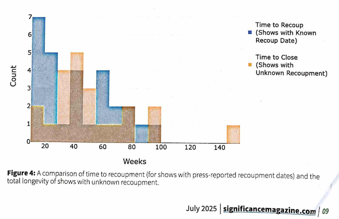
Figure 4 in the article is the following chart:

The chart compares histograms for two groups of shows. The reference group (blue) are shows known to have recouped their investments with a known recoupment date, some weeks after opening. The histogram presents the time to recoupment. The comparison group (orange) are shows that closed but without public information that can be used to figure out if the investors recouped their money before closing. This histogram displays the time until closing. The chart was conceived in an effort to guess the "label" for the second group of shows; should they be called a success (recouped) or a failure in the analysis?
In the authors' own words, then:
Figure 4 compares the total running times of these shows to the recoupment times of the 22 shows with known recoupment dates, suggesting that many likely did not last long enough to recoup.
I'm confused as to how the histograms support this conclusion. The above statement suggests that the shows with unknown recoupment dates have generally closed earlier than those with known recoupment dates. In the chart, I counted 12 blue shows that closed within 30 weeks against 3 such orange shows. Considering the entire histograms, I also don't sense that the orange one is poised to the left of the blue one. (One possibility is the color labels were accidentally swapped.)
***
The above observation then leads me down the rabbit hole of investigating the source of confusion.
Since the authors clearly stated that there were 22 shows with known recoupment dates, I can see which columns sum up to 22. The blue columns: 7+5+1+4+1+4+2+2+1+1 = 28 shows while the orange columns: 2+1+4+5+3+1+1+2+2+1=22 shows. It'd seem that the orange histogram corresponds to the shows with known recoupment dates, confirming that the labels were swapped. I just have to check the number of shows that closed but with unknown recoupment status. In the article, they said "we were left with 28 final shows whose recoupment status had to be manually classified" so this made me feel better.
Here's a version of their chart with the right color labels:

Note that I switched the colors to blue and yellow so that the merged color is green, which is more easily understood than blue+orange = brown.
***
Back to the overlapping histograms, it's very confusing to have created three colors for two groups.
It's clearer to stack them top and bottom:

Or just print the outline of the reference histogram:

***
They really should have used density histograms instead of count histograms, given that the two groups have different number of shows. Plotting proportions are fine too although density histograms have better statistical properties (as I explained here).


