Hypnotized by seasonlity
But the interesting thing is not here

Long-time reader Chris P. pointed me to this informative blog post by the Energy Institute at Haas (link) that compares different ways to plot time-series data with clear seasonality.
The "canonical" plot for this data set is a column chart.
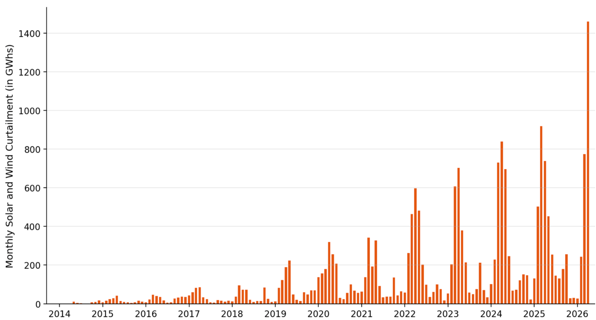
This chart is made by CAISO, the California Independent System Operator. The data concern the amount of energy that is "curtailed" at solar and wind power generators for each month of each year. Curtailment is a measure of "idle capacity," the amount of additional energy that could have been produced based on the sunshine or wind that was available but wasn't produced due to other constraints.
(I don't think I completely grasp the import of the curtailment metric. It appears curtailment implies that some other factors were limiting energy production. Wouldn't it be more actionable to focus on those constraints, as opposed to a factor that is abundant and effectively free? Let's focus on the visualization in this post, though.)
The column chart reveals two quick insights: there is strong seasonality in this dataset, and in addition, we see a trend of growth from 2014 to 2026. We might surmise that this year (2026) might be an outlier. These three aspects feature frequently in time-series data, so this dataset is great for exploring visualizations.
The author tries a variety of plots: ridgeline, multiple lines, "cycle plot", and heatmap.
The multiple-line chart is a favorite of many.
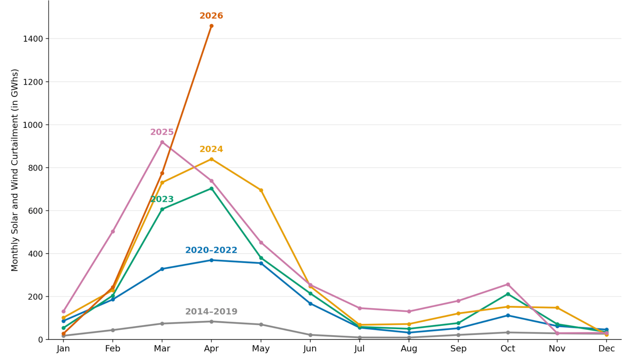
On such charts, each line represents a year. The monthly values are vertically aligned, making it easy to spot seasonal patterns. As the author discovered, the "year-over-year overlay ... quickly becomes cluttered." If you blink, you may miss that the lowest two lines (gray and blue) do not depict single years but the average annual amount for multiple years.
Aggregation is one way to clean up the mess. Another is to use colors to differentiate foreground and background.
The line chart makes it much easier to locate the seasonal peaks, as well as to see the 2026 extreme.
The author favors the following "cycle plot".
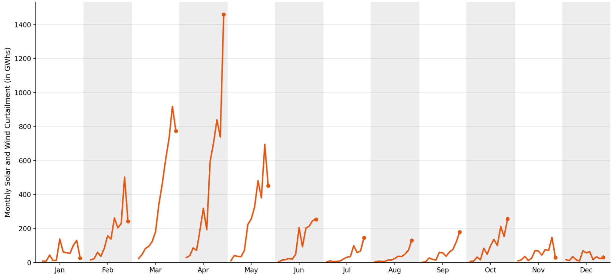
If you haven't seen this chart before, you'll need a minute or two to learn how to read it.
One way to get there: start with the multiple-line chart above, swap the roles of the month and the year, so that each line represents a month, and the horizontal axis runs through the years; lastly, remove the overlay and give each line its own plot area.
On this "cycle plot", each line traces the change in values for a given month. The increasing trend over years is obvious; this chart specifically highlights the varying slopes of this growth by month of year.
(At least one of you will comment below and complain that the lines connect observations one year apart, and prefer to see a column chart instead. For this visualization, it's a reasonable variation. As many readers know, I don't think much of the "rule" that says lines only for continuous data.)
What about the seasonality? It's there, but not as obvious. The average seasonal shape is, roughly speaking, the line that connects the average value on each plot. Imagine an envelope that hovers over these lines; that's the seasonality, roughly.
See this related post about the "spiral of death" Arctic ice volume chart. The solution is very similar.
When it comes to time-series data, many researchers are hypnotized by seasonality. Upon seeing seasonality, they stop seeing other things.
That's the biggest flaw of the multiple-lines presentation. That chart emphasizes the seasonal pattern of the data within any given year. By focusing on seasonality, the design makes it much tougher to discern the year-to-year trends.
But the seasonal pattern in this dataset is not shifting in any meaningful way. There is more interesting things going on in the trend.