It's all there, even if you can't see it
Delivering messages in data visualization
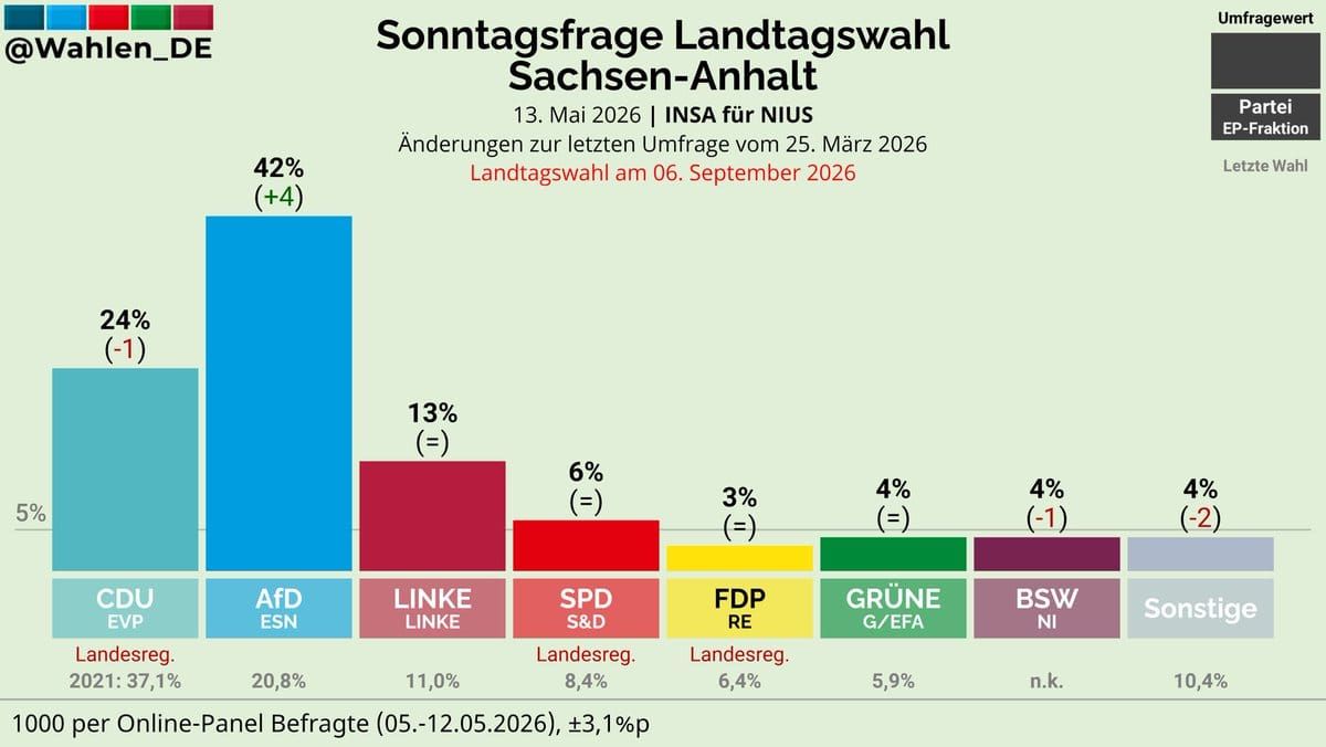
Reader Jean-Claude F. flagged the above chart from a German publication on Twitter as a "very, very bad graph design". He has a point.
The chart concerns poll results from May 2026 about the upcoming local elections in the Saxony-Anhalt state of Germany. Eight parties are in the running.
It was not obvious to me that those black boxes hanging out in the top right corner constitutes a legend. I figured this out after asking GPT to translate the words.
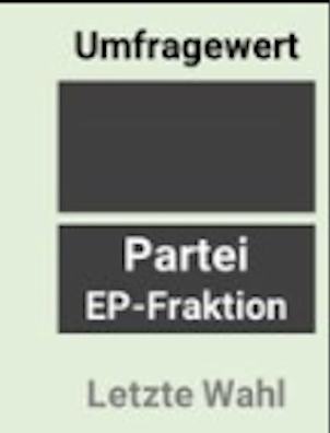
They say Poll Result, Party – European Parliment group, and Last Election (Result).
In other words, the data are found in the top box while the bottom box carries the column labels.
Putting the names of parties inside boxes with the same colors as the columns has the effect of artificially extending these columns by a fixed height. This tactic has the reverse effect as the oft-maligned tactic of not starting columns at zero, thereby kneecapping each column by a fixed height. Either form of distortion is undesirable.
One alternative is printing the party names in their respective colors. Another is to print them in black, entrusting readers to associate party with column color.
The key messages of this dataset can be stated:
- The current coalition government led by CDU (and including also SPD and FDP) is in danger of losing power, as the second largest party (AfD) is leading the polls.
- AfD's strength has grown since the last poll in March, and is closing in on attaining the majority all by itself.
- Five of the smaller parties may not get any seats if their support doesn't rise above the minimum threshold of 5%.
Now, let's find these messages on the chart shown above.
To learn bullet point #1, we need to realize that the current government comprises a coalition of three parties. The red text underneath three of the columns ("Landesreg.") acts as the visual cue that CDU, SPD and FDP are currently in power. Summing the vote shares from 2021 should confirm that they hold more than 50% of the seats. If the current poll results presaged the election result, these three parties are expected to earn only about 33% of the vote this year (a sum left to readers to compute in their heads).
Meanwhile, the second largest party in the current government (AfD) is leading the polls with 42% share. AfD could more than double its number of seats – an insight requring collecting the percentages at either end of the column. Further, AfD is still gaining popularity, as the number in parenthesis tells us.
The smallest five parties have columns that are shorter than the boxes storing their names. Blink and you'll miss the horizontal line cutting across at 5% height, hiding behind the taller columns. Without Jean-Claude's notes, I wouldn't know that a party does not get any seats unless it gains at least 5% of the vote. All these five parties have poll shares that are dangerously close to 5%, given the margin of error seen in the footnote of 3.1%.
The chart actually supplies all the contextual information but it's up to readers to figure out how to use them. Improving this chart is an exercise in bringing out its key messages.
The key points can be conveyed effectively on a pair of pie charts.
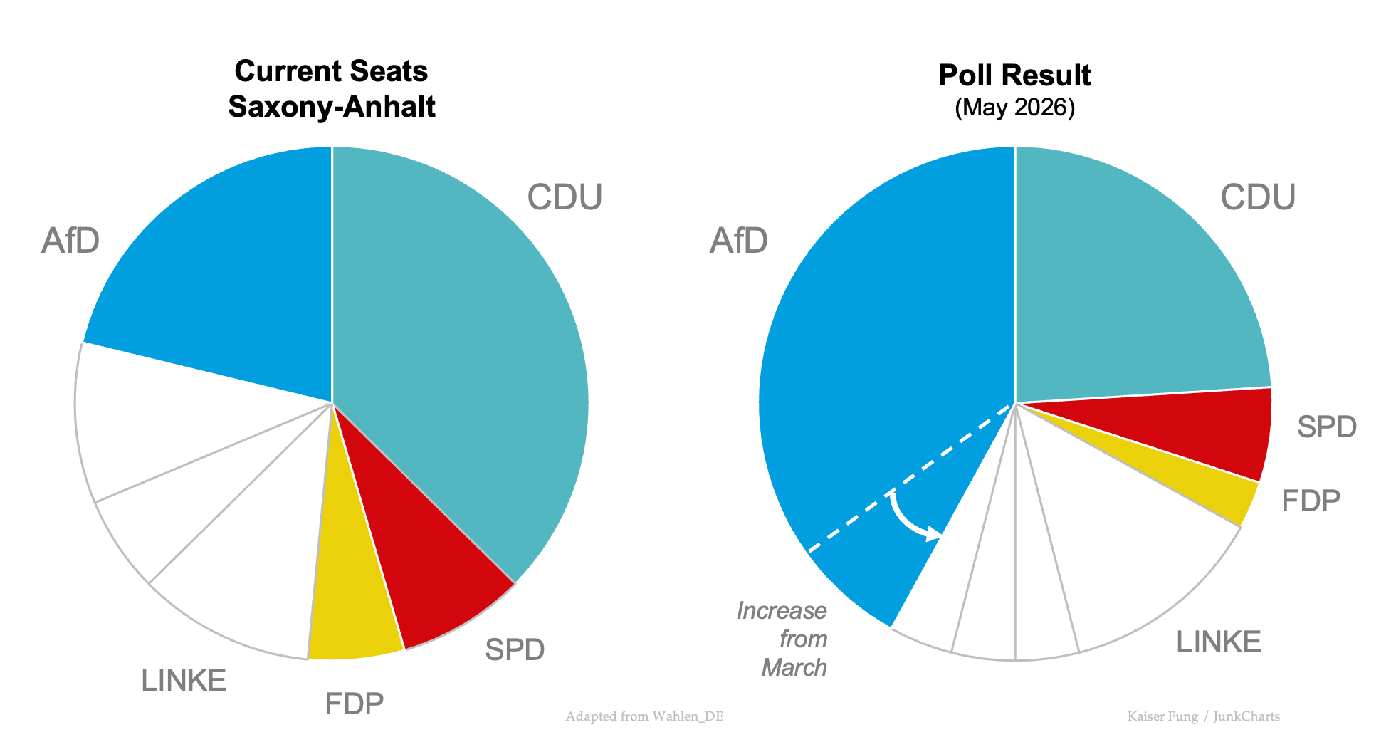
I did not print the data on the chart. You should be able to see that CDU+SPD+FDP currently hold just over the majority. But in the May poll, the coalition only received support from a third of respondents, with CDU in particular suffering a massive decline.
In the the meantime, AfD has more than doubled its power, so to speak. The outlook is even better as the polls are moving in the right direction.
P.S. [8-26-26] Corrected CDU in various places. [9-10-26] Corrected CDU labels in the chart exhibit.