Key decisions when making heatmaps
Further comments on the curtailment charts
In a previous post, I discussed several chart forms that can be used to illustrate time-series data with seasonality and trending. The post was inspired by a blog post at the Energy Institute at Haas.
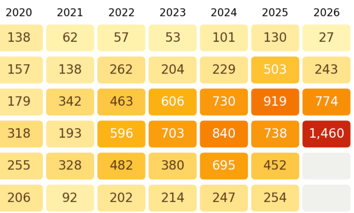
I held off on discussing one of the more interesting alt versions of the visualization. Here it is:
The author experimented with this heatmap.
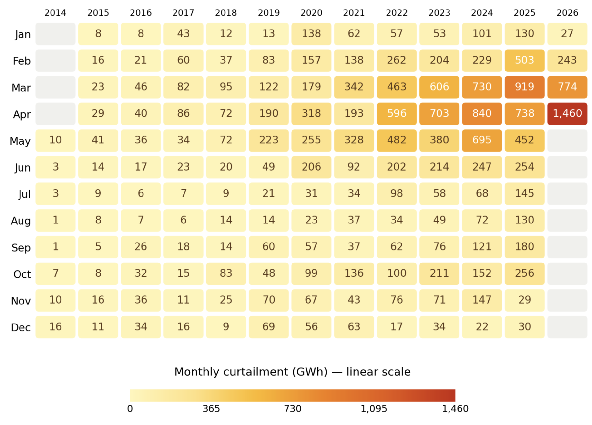
The monthly dataset is laid out as a grid, with years as columns, and months as rows. Each cell is a specific month-year.
They chose a color scheme that is quite easy to interpret. Our eyes quickly finds the orange-red cluster of values on the top right corner.
The heatmap can be regarded as an annotated data table.
Building heatmaps from numeric data presents several formidable challenges. Let's face them head on.
What to encode with colors?
Compared to other options such as bar lengths, positions of dots and lines and even pie angles, color encoding is less precise.
Recall my self-sufficiency test. There is a reason why the entire dataset is printed on the page: should those numbers disappear, you'll be at a loss trying to estimate the difference in values given the perceived difference in colors.
The heatmap design affords very high precision to the dates of record but lower precision to the values of curtailment.
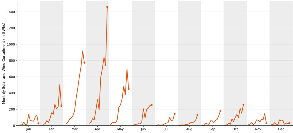
This problem is not purely academic. Scan down any column in the heatmap, and you'll fail to see the "seasonality" that was so obvious in all the other charts.
Here's the cycle plot from the last post – just a reminder of the key insights from the dataset:
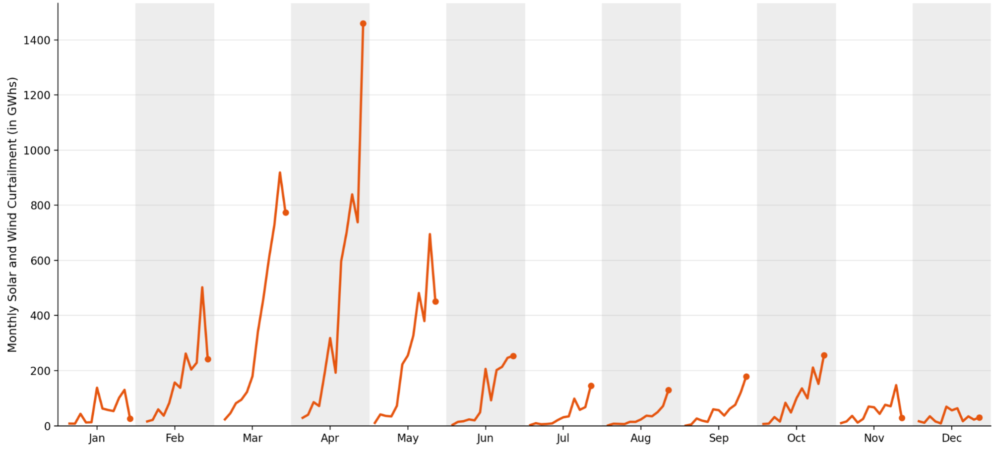
The clear growth trends in July, August, September, and October are muted on the heatmap.
Sometimes, picking a different variable to encode in color may help. For this dataset, there isn't a better choice.
How many scales?
The primary reason why obvious seasonality and trending vanish from the heatmap is the choice to use a single color scale for the entire chart.
Because of some extreme values on the right side (and the mapping is linear), the smaller values are cramped together.
The designer has other options.
One can apply a color scale for each column, so 13 scales for 13 columns. I say 13 scales because now the yellow in one column is the same as the same yellow in another column – in a relative sense; each year's value relative to the respective year's range of values. The yellow in one column does not represent the same absolute value as the yellow in other columns (see the legend labels).
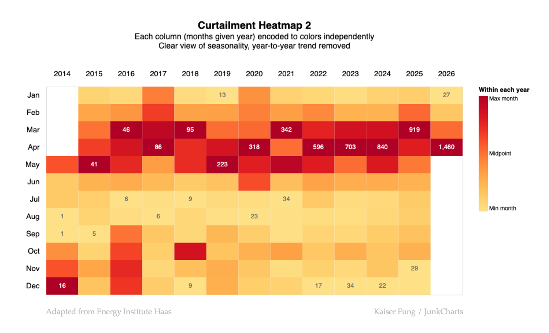
For example the orange sitting in the middle of the 2016 scale is the midpoint between the minimum and maximum values of 2016. The same orange in 2017 is the midpoint value for 2017. Those two midpoint values are not the same in absolute terms but they are identical in relative terms.
Thie rendering brings up the seasonality of the data (curtailment is highest from March to May) but it's not great at showing the year-to-year trending.
Next, the third option is to apply a color scale for each row, so 12 scales for 12 rows.
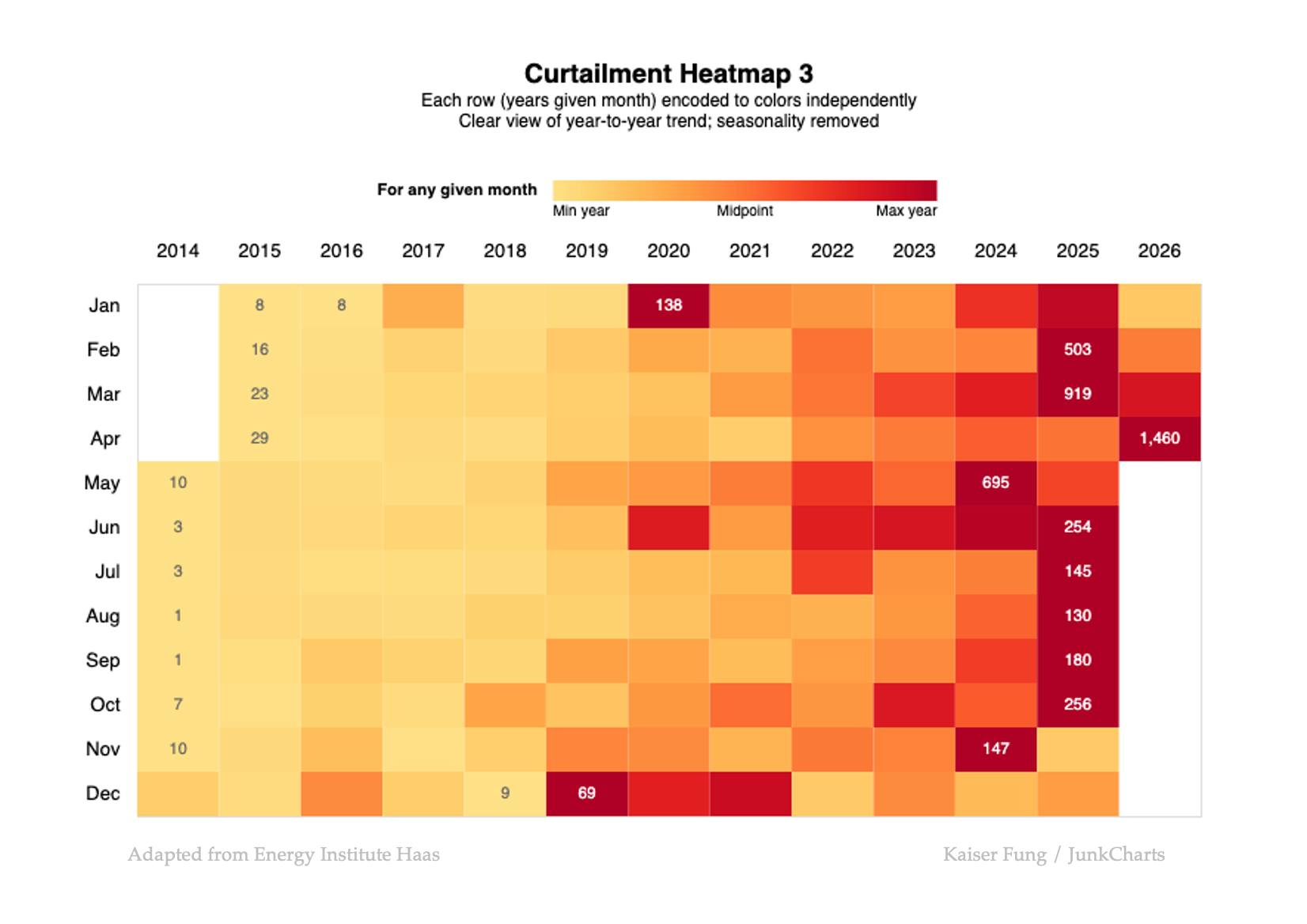
Now, the orange represents the midpoint value for a given month across the 13 years. This version brings out the trending (curtailment has grown steadily every year, except in December) while messing up the seasonality.
Smoothing
Another undesirable feature of these heatmaps is the abrupt changes in color from cell to cell. It's like watching HDTV when you realize you're staring at a pore on someone's face.
A nice solution is to smooth the data before encoding.
The heatmap is an interesting choice, and sometimes works well. There are important design decisions to make a better heatmap. Hope this post is helpful.