Making sense of long data sequences
Visualizing football tactics
In the game of football (i.e. soccer), players pass the ball around, and eventually someone takes a shot. If the ball breaches the net, the team scores a point, and the game restarts from the center. If an errant shot surpasses the goal line, the opposing goalkeeper restarts the action; if the shot is intercepted by an opponent pushing the ball out of bounds, the attacking team retains possession and restarts the action with a corner or a throw-in. The action can also be stopped and restarted before a shot attempt, if the ball lands out of bounds at any time. If a referee accidentally touches the ball, a restart is in order...
I won't detail all the possibilities. The point is that a football match can be represented by a set of sequences, each of which has a distinct (re)start and a distinct end. Each sequence involves a subset of the players; the same player can feature multiple times. Each ending signifies the ball never reaching another player – it goes out of bounds, or into goal, or hits a ref; or a foul is called, or a stoppage is permitted for half-time, substitutions, injuries, not to mention theatrical writhing, or in the latest twist, advertiser hydration.
With modern video processing and sensor data, analysts can visualize and dissect these sequences. One should be able to figure out which team is playing based on the style of play described by patterns contained in these sequences.
Brennan Klein's research group at Northeastern has published some maps based on these sequences. (Brennan and I crossed paths some years ago.)
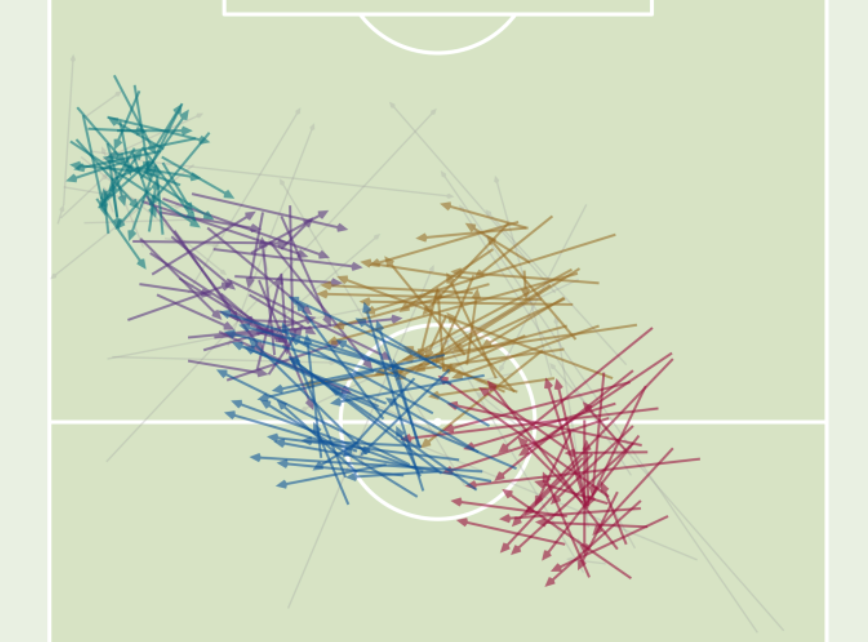
The following map shows a team, during the 2022 World Cup, that executed a large number of passes, most frequently on the front side of midfield. These players spend a lot of time passing the ball around, it appeared. What team might this be?
The national football team known for lots of short passes around the midfield is Spain. Its iconic "tiki-taka" style of play has dazzled football fans in recent years. The passing cluster map depicted one aspect of the shape of their passing sequences during the 2022 World Cup.
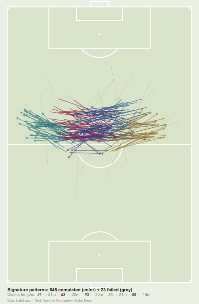
Which team deployed the following passing patterns?
This team passed the ball a lot on its own side of the field, horizontally. When they attacked, it was more likely to come from the left flank. I inferred that attacks at goal utilized long balls, but their frequency was not sufficiently high to appear on the map. During the 2022 World Cup, this team executed about 40% fewer passes than Spain did.
The above diagram visualized England's tactics.
Each arrow shows an individual pass. A cluster contains passes of similar lengths and directions. The analysis has broken up the sequences, like we turn sentences into bags of words. Yet, the influence of the sequences is still palpable because the ball has to go somewhere.
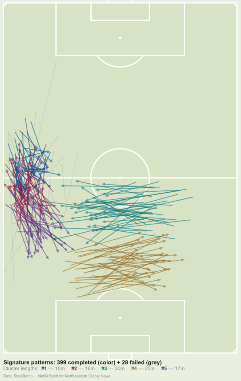
Visualizing all sequences directly would make quite a mess. Each passing cluster is the analyst's abstraction. It contains passes from many sequences, but only relevant passes from each sequence.
I'd be interested in seeing clusters formed from two- or three- consecutive passes. Or perhaps, clusters conditional on another cluster. For example, given that the subset of sequences that have contributed to a "red" cluster, what are the passing clusters that form in the continuation of these sequences?
Brennan's group has been blogging about football analytics throughout the World Cup. Check them out here!