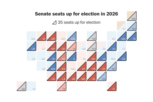
Rearranging deck chairs
A recipe for improving data visualization
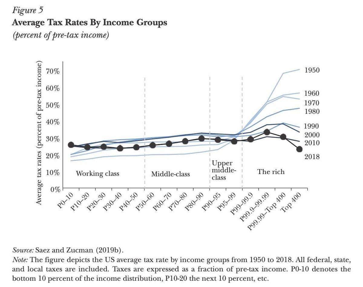
Avinash highlighted this chart by economists Saez and Zucman that paints a vivid picture of what's happening to average tax rates by income group in the U.S. It goes a long way in explaining why there is such dismay with income distribution.
The population is divided into roughly 10 groups of equal size (deciles). The top decile, those with income above the 90th-percentile, is subdivided into six additional groups, with the top group consisting of just 400 people.
In simple terms, the lines have not moved much for the bottom 11 groups, i.e. anyone not in the top 1%. Deeper blue indicates more recent data. If anything, these lines have shifted upwards, meaning that everyone not in the top 1% has been paying slightly higher tax rates over time.
The top 1% (subdivided into four groups) have seen a dramatic decrease in tax rates. By 2000, they become somewhat "linear" with the other income groups. But don't let this chart fool you – because of the subdivision of the top 1%, the numbers on the horizontal axis are not "linearly" increasing.
The authors of the chart defined income groups analytically – by chopping up the income distribution into deciles.
The chart strongly suggests the effectiveness of a different way of defining "rich". Any cohort that has their tax rates decline over time defines "the rich". This criterion would have handsomely bisected the above axis into two obviously different sections.
Astute readers may recognize that the Saez-Zucman chart uses the same form and convention as the line charts in my prior posts on beef and egg prices.
The following variant tells an even more compelling story:
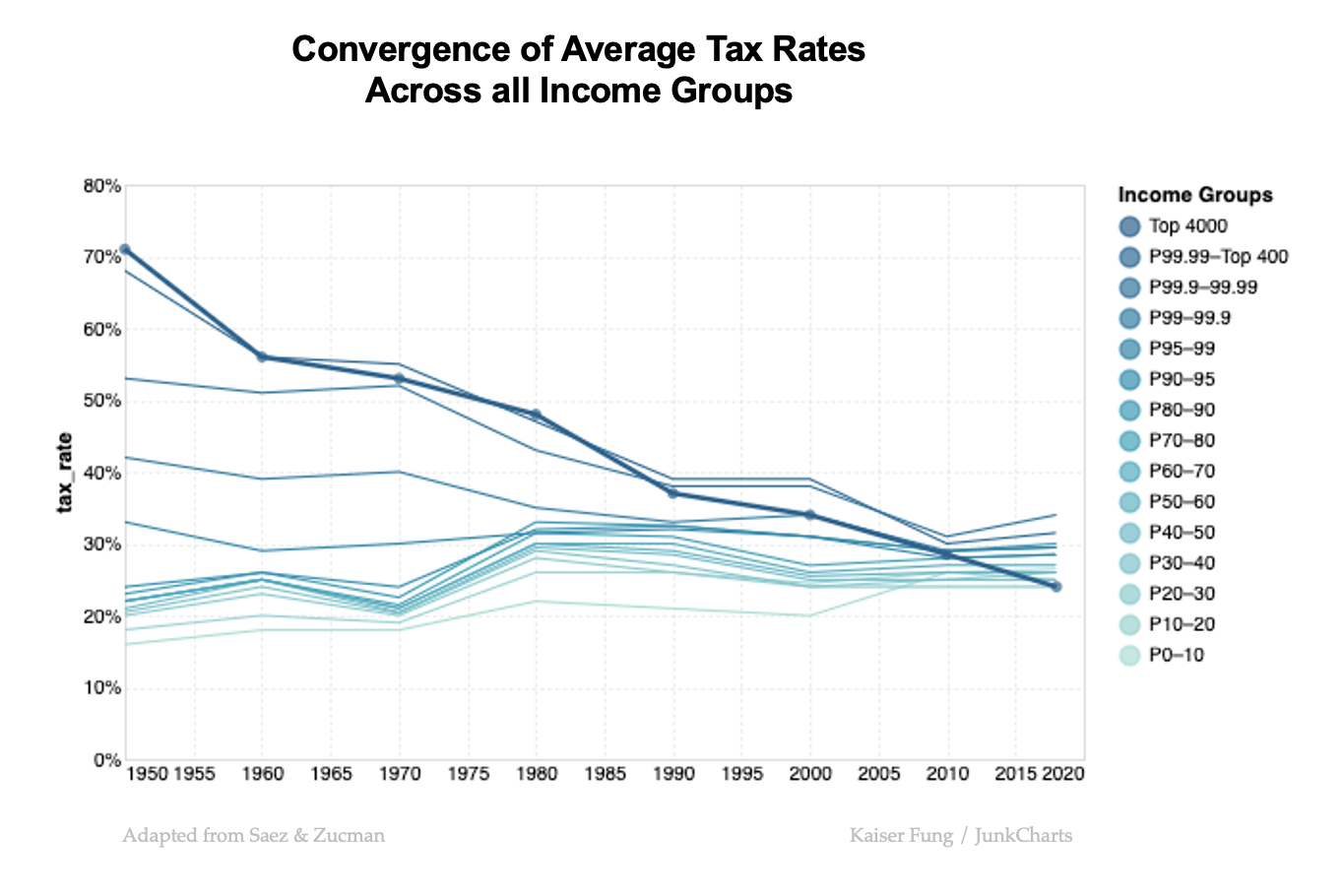
All l have done is to flip the roles of the income groups and time. Time now flows left to right. Each line represents an income group; the deeper the blue, the richer the people represented.
A massive convergence pattern is seen. In the 1950s, higher income groups pay dramatically higher tax rates (they also earn dramatically more money than the lower income groups). By the 2010s, everyone's tax rates have been squeezed into the 25-35% range.
Further, the deeper blue lines are downward trending, meaning these groups have benefitted from lower taxes. The light blue lines? Their tax rates have increased slightly over time.
By 2020, the richest 400 Americans made a huge breakthrough. They finally have become the group that pays the lowest income tax. Wow!