ray vella Displaying convoluted indices Kaiser shows how a small change in structure clarifies comparisons on a data visualization project.
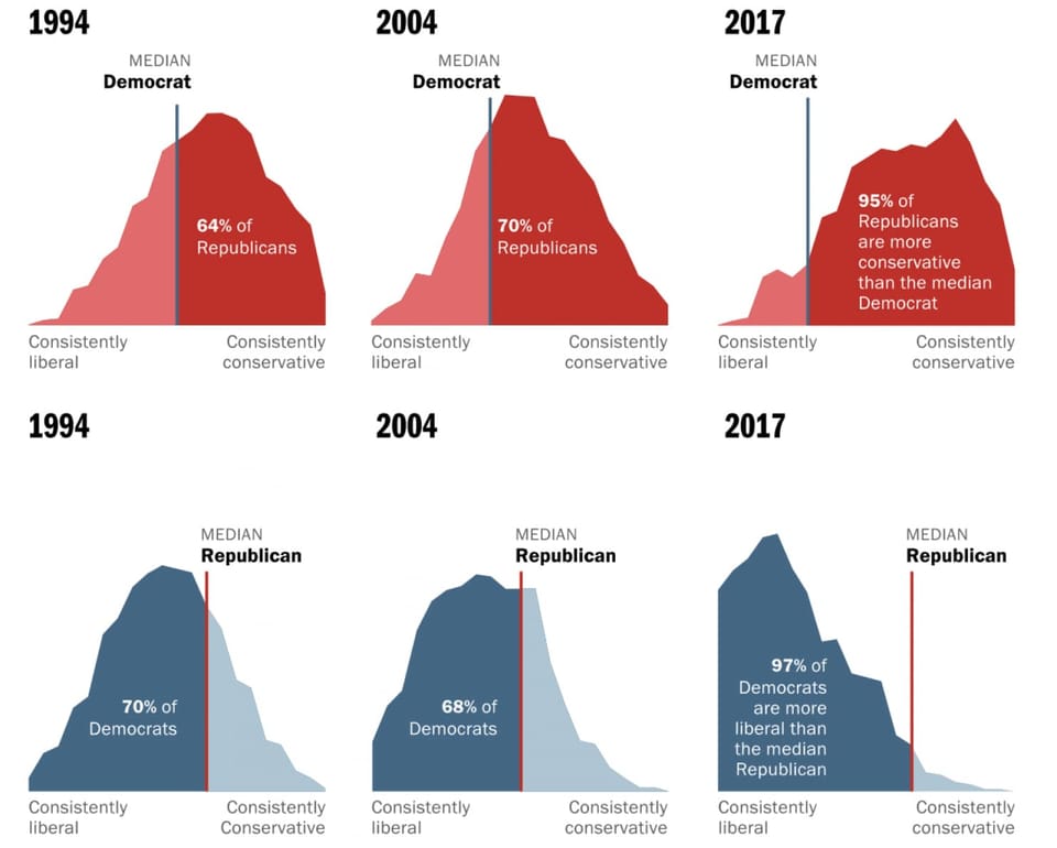
Area chart Let's not mix these polarized voters as the medians run away from one another In-depth look at Washington Post's fantastic feature on median U.S. voters
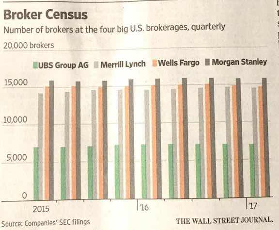
Axis Making people jump over hoops Kaiser Fung, founder of Principal Analytics Prep and Junk Charts, comments on a WSJ chart about how banks pay their brokers