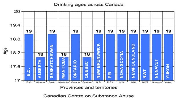
Axis Which software is responsible for this? @guitarzan wants us to see this chart from north of the border,
Bar chart A straight line going nowhere fast, despite tweets and likes Ken B., another Australian reader, wasn't too proud of this
Bubble chart Insufficiency and illusions This WSJ graphic gives me a reason to talk about the self-sufficiency
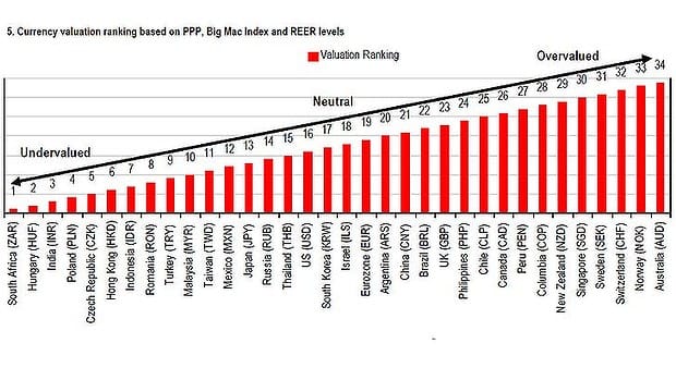
Axis Look what I found: two amazing charts While doing some research for my statistics blog, I came across a
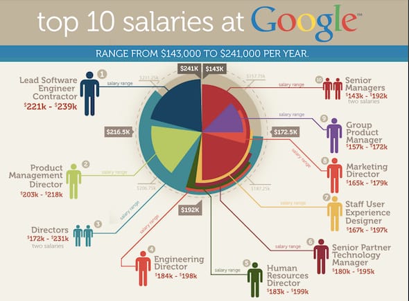
Bar chart The massive burden of pie charts The world would be a better place if pie charts were banned.
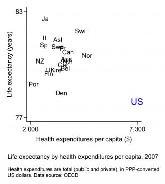
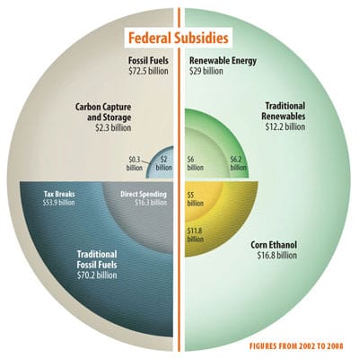
Aggregation Worst statistical graphic nominated Phil, over at the Gelman blog, nominates this jaw-dropping graphic as the