Junk Charts
  • About
  • RSS
  • Posts by Year
  • Posts by Keywords
Sign in Subscribe

Interactive

Applying the band-aid, missing the wound
Aggregation

Applying the band-aid, missing the wound

Common mistakes in stacked column charts
Read More
There is a time and a place for every shadow and cloud
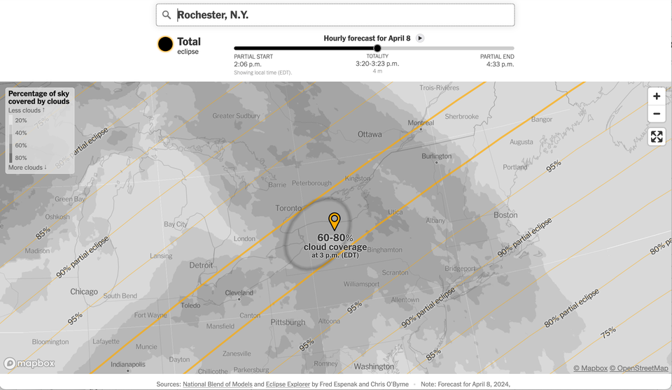
NYT

There is a time and a place for every shadow and cloud

A beautiful NYT project masterfully handling time and space dynamics
Read More
Gaining precision by deleting data
Current affairs

Gaining precision by deleting data

How to gain precision by deleting data
Read More
Election coverage prompts good graphics
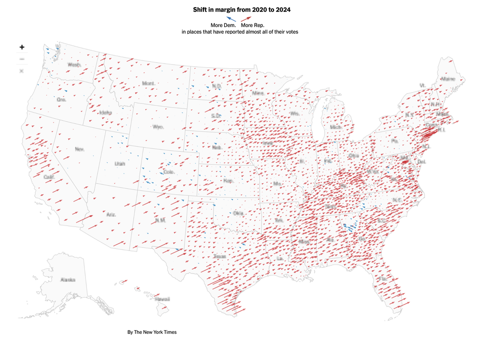
Aggregation

Election coverage prompts good graphics

Election coverage brings out the best of interactive graphics
Read More
Adjust, and adjust some more
Axis

Adjust, and adjust some more

Kaiser looks at an interactive chart in the Financial Times.
Read More
Prime visual story-telling
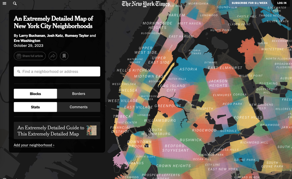
Clustering

Prime visual story-telling

Kaiser appreciates this wonderful example of visual storytelling.
Read More
Page 1 of 4 Older Posts →
Junk Charts © 2025
  • BOOKS
  • COURSES
  • PRESS
  • CONSULTING
  • COACHING
  • CONTACT
Powered by Ghost