Junk Charts
  • About
  • RSS
  • Posts by Year
  • Posts by Keywords
Sign in Subscribe

Interactive

Adjust, and adjust some more
Axis

Adjust, and adjust some more

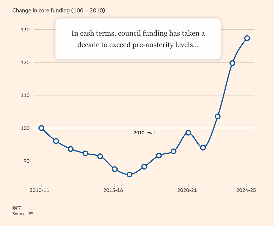
Kaiser looks at an interactive chart in the Financial Times.
Read More
Prime visual story-telling
Clustering

Prime visual story-telling

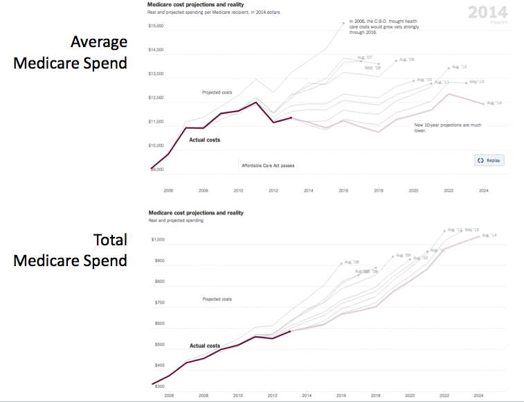
Kaiser appreciates this wonderful example of visual storytelling.
Read More
Relevance, to you or me: a response to Cairo
Aggregation

Relevance, to you or me: a response to Cairo

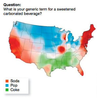
Alberto Cairo discussed a graphic by the New York Times on the
Read More
How effective visualization brings data alive
Aggregation

How effective visualization brings data alive

Bringing data alive
Read More
Hard work pays off
Animation

Hard work pays off

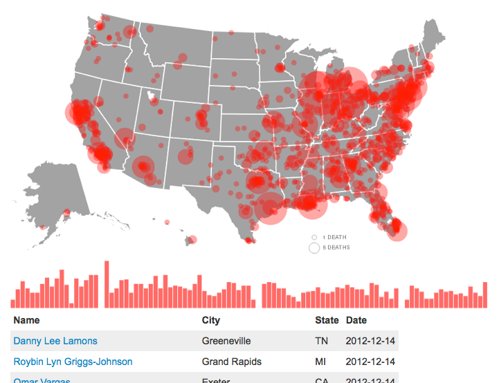
At the NY Tech Meetup, Andrei Scheinkman showed off some work his
Read More
Lost in complexity
Business

Lost in complexity

Felix Salmon (link) and others linked to this BBC News graphic about
Read More
← Newer Posts Page 2 of 4 Older Posts →
Junk Charts © 2026
  • BOOKS
  • COURSES
  • PRESS
  • CONSULTING
  • COACHING
  • CONTACT
Powered by Ghost