Aggregation Digital revolution in China: two visual takes Kaiser Fung, founder of JunkCharts and Principal Analytics Prep, discusses a map in the Economist about the digital silk road in China. What's the story?
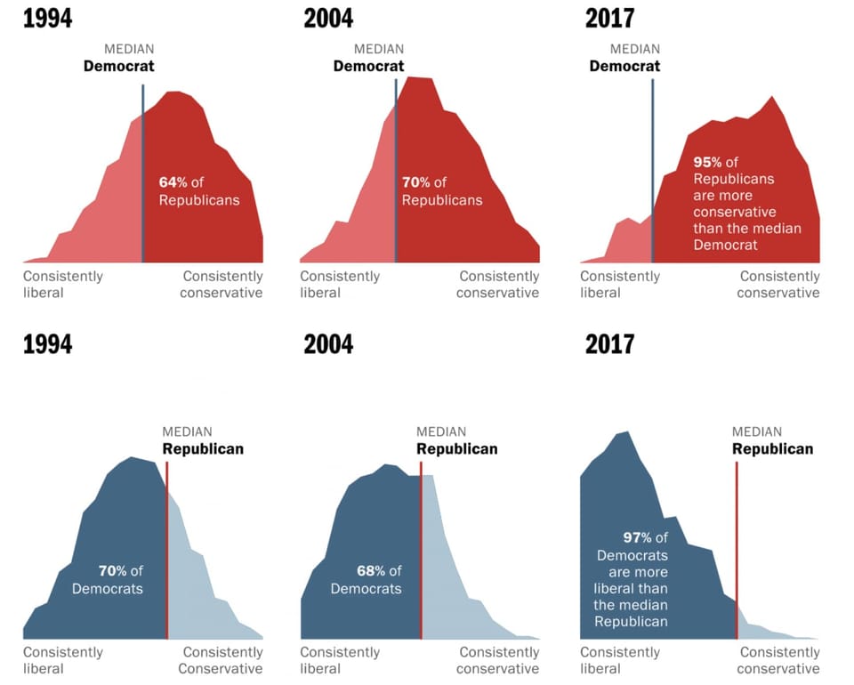
Area chart Let's not mix these polarized voters as the medians run away from one another In-depth look at Washington Post's fantastic feature on median U.S. voters
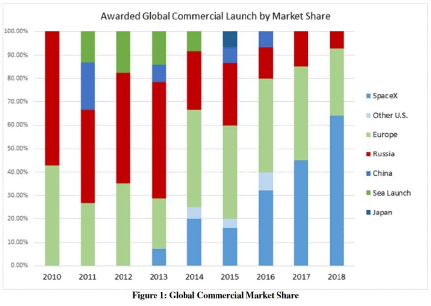
Axis Another simple Excel chart needs help Kaiser Fung, founder of Principal Analytics Prep and Junk Charts, takes apart an Elon Musk chart, created using some Excel defaults.
Comparability Visualizing citation impact Michael Bales and his associates at Cornell are working on a new
Aggregation Depicting imbalance, straying from the standard chart My friend Tonny M. sent me a tip to two pretty nice