Junk Charts
  • About
  • RSS
  • Posts by Year
  • Posts by Keywords
Sign in Subscribe

Small multiples

the wtf moment
Bar chart

the wtf moment

the wtf moment in dataviz
Read More
Election coverage prompts good graphics
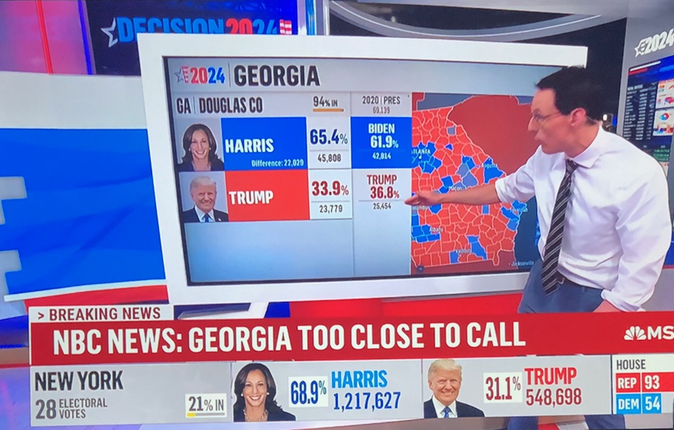
Aggregation

Election coverage prompts good graphics

Election coverage brings out the best of interactive graphics
Read More
Using disaggregation in dataviz
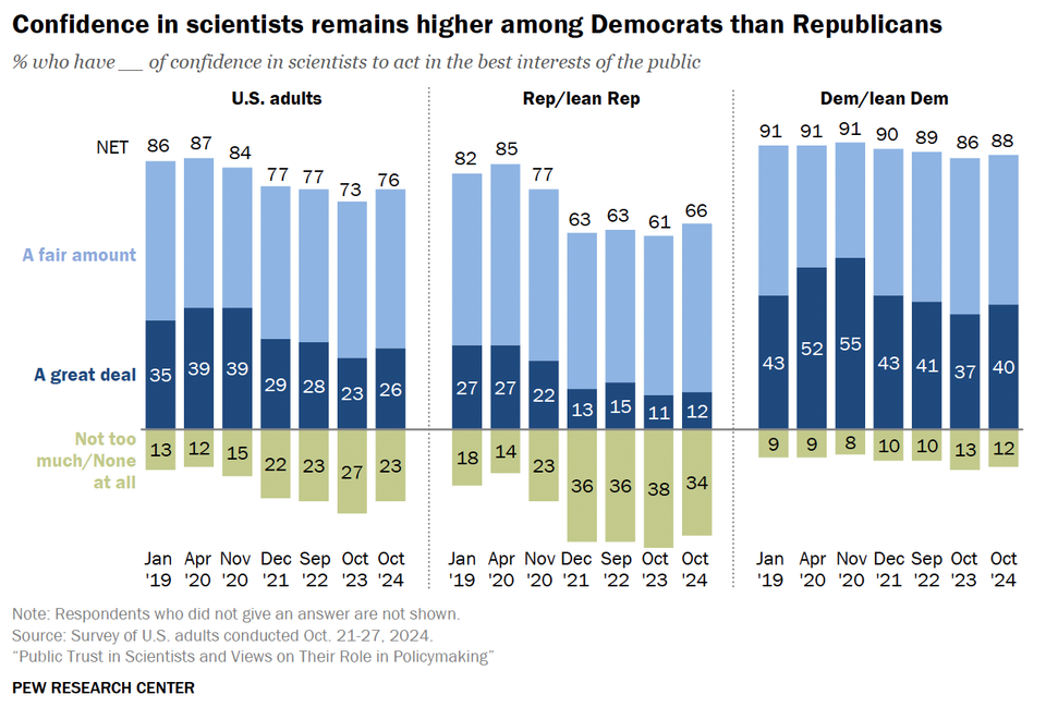
Aggregation

Using disaggregation in dataviz

Disaggregating data can be very useful when making charts
Read More
Pie charts and self-sufficiency
Business

Pie charts and self-sufficiency

A series of pie charts is used to demonstrate a trend
Read More
Expert handling of multiple dimensions of data
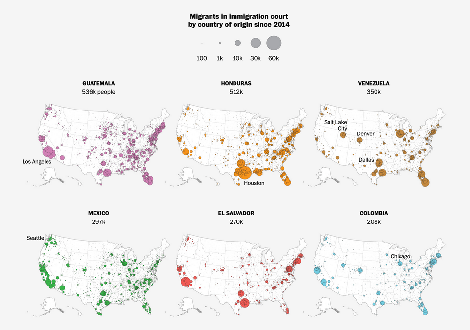
Current affairs

Expert handling of multiple dimensions of data

Kaiser enjoys a set of maps about American immigration.
Read More
The radial is still broken
Background

The radial is still broken

Kaiser puzzles out yet another radial chart.
Read More
← Newer Posts Page 3 of 8 Older Posts →
Junk Charts © 2026
  • BOOKS
  • COURSES
  • PRESS
  • CONSULTING
  • COACHING
  • CONTACT
Powered by Ghost