Junk Charts
  • About
  • RSS
  • Posts by Year
  • Posts by Keywords
Sign in Subscribe

Text

The smell of pie charts
Pie chart

The smell of pie charts

An attempt to deodorize
Read More
Forced roommates, favoritism, and more in data visualization
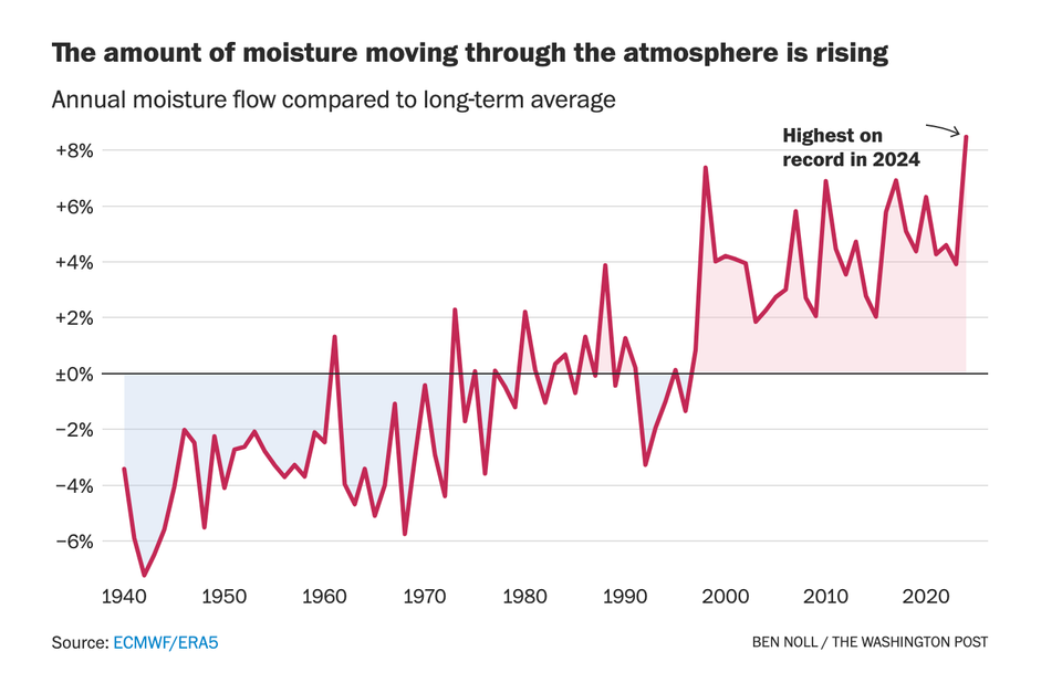
dual axes

Forced roommates, favoritism, and more in data visualization

Why is this dual-axes chart so taxing to read?
Read More
Big drops and big dots
line chart

Big drops and big dots

Droppings at BLS
Read More
Simple is not always easy
Bar chart

Simple is not always easy

Simple design is not always easy
Read More
Clear and confused states
interpretation

Clear and confused states

What does pink mean on this map?
Read More
Why is this chart confusing?
histogram

Why is this chart confusing?

A confusing chart on Broadway shows
Read More
Page 1 of 5 Older Posts →
Junk Charts © 2026
  • BOOKS
  • COURSES
  • PRESS
  • CONSULTING
  • COACHING
  • CONTACT
Powered by Ghost