The message left the visual
The message ran off the chart
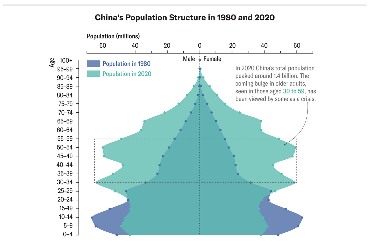
The following chart showed up in Princeton Alumni Weekly, in a report about China's population:

This chart was one of several that appeared in a related Scientific American article.
The story itself is not surprising. As China develops, its birth rate declines, while the death rate also falls, thus, the population ages. The same story has played out in all advanced economies.
***
From a Trifecta Checkup perspective, this chart suffers from several problems.
The text annotation on the top right suggests what message the authors intended to deliver. Pointing to the group of people aged between 30 and 59 in 2020, they remarked that this large cohort would likely cause "a crisis" when they age. There would be fewer youngsters to support them.
Unfortunately, the data and visual elements of the chart do not align with this message. Instead of looking forward in time, the chart compares the 2020 population pyramid with that from 1980, looking back 40 years. The chart shows an insight from the data, just not the right one.
A major feature of a population pyramid is the split by gender. The trouble is gender isn't part of the story here.
In terms of age groups, the chart treats each subgroup "fairly". As a result, the reader isn't shown which of the 22 subgroups to focus on. There are really 44 subgroups if we count each gender separately, and 88 subgroups if we include the year split.
***
The following redesign traces the "crisis" subgroup (those who were 30-59 in 2020) both backwards and forwards.

The gender split has been removed; here, the columns show the total population. Color is used to focus attention to one cohort as it moves through time.
Notice I switched up the sample times. I pulled the population data for 1990 and 2060 (from this website). The original design used the population data from 1980 instead of 1990. However, this choice is at odds with the message. People who were 30 in 2020 were not yet born in 1980! They started showing up in the 1990 dataset.
At the other end of the "crisis" cohort, the oldest (59 year old in 2020) would have deceased by 2100 as 59+80 = 139. Even the youngest (30 in 2020) would be 110 by 2100 so almost everyone in the pink section of the 2020 chart would have fallen off the right side of the chart by 2100.
These design decisions insert a gap between the visual and the message.


