Visualizing hierarchies
Bonus: setting gridlines on a circular chart
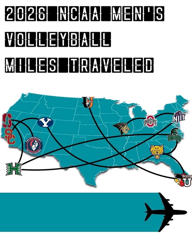
Long-time reader Chris P. sent me to an Instagram user (link) who analyzed the travel schedules of all the NCAA men's volleyball teams.
The analysis is deceptively simple if we ignore data collection – the outputs are distances travelled for each team, grouped by conference. The inputs? At least, schedules from each conference, including home/away indicators; maps; campus maps. The analyst describes how much work it is to put together this "simple" dataset. The process also includes the elephant in the room – assumptions!
For example, to be accurate, one wants to know where each team's home gym is but that venue is not always obvious to an outsider. So, in some cases, the analyst resorts to using the coordinates of the school's campus.
Unpacking assumptions is like pulling apart an onion. In that latter scenario, how does one determine the coordinates of any campus? Many schools are not one contiguous space, and even if it's one connected space, it almost surely has a highly irregular shape! In the other scenario, we must make another assumption: that teams always depart from their home gym.
Enough about the data. We're here to talk about the visualization.
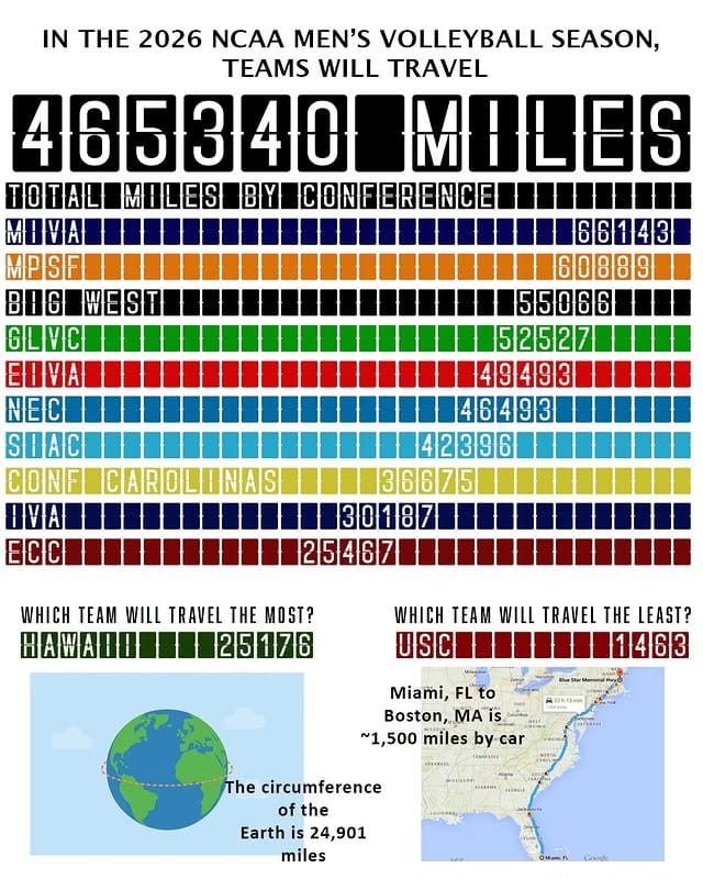
Here is a different chart in the series, focused on comparing schools in a particular conference:
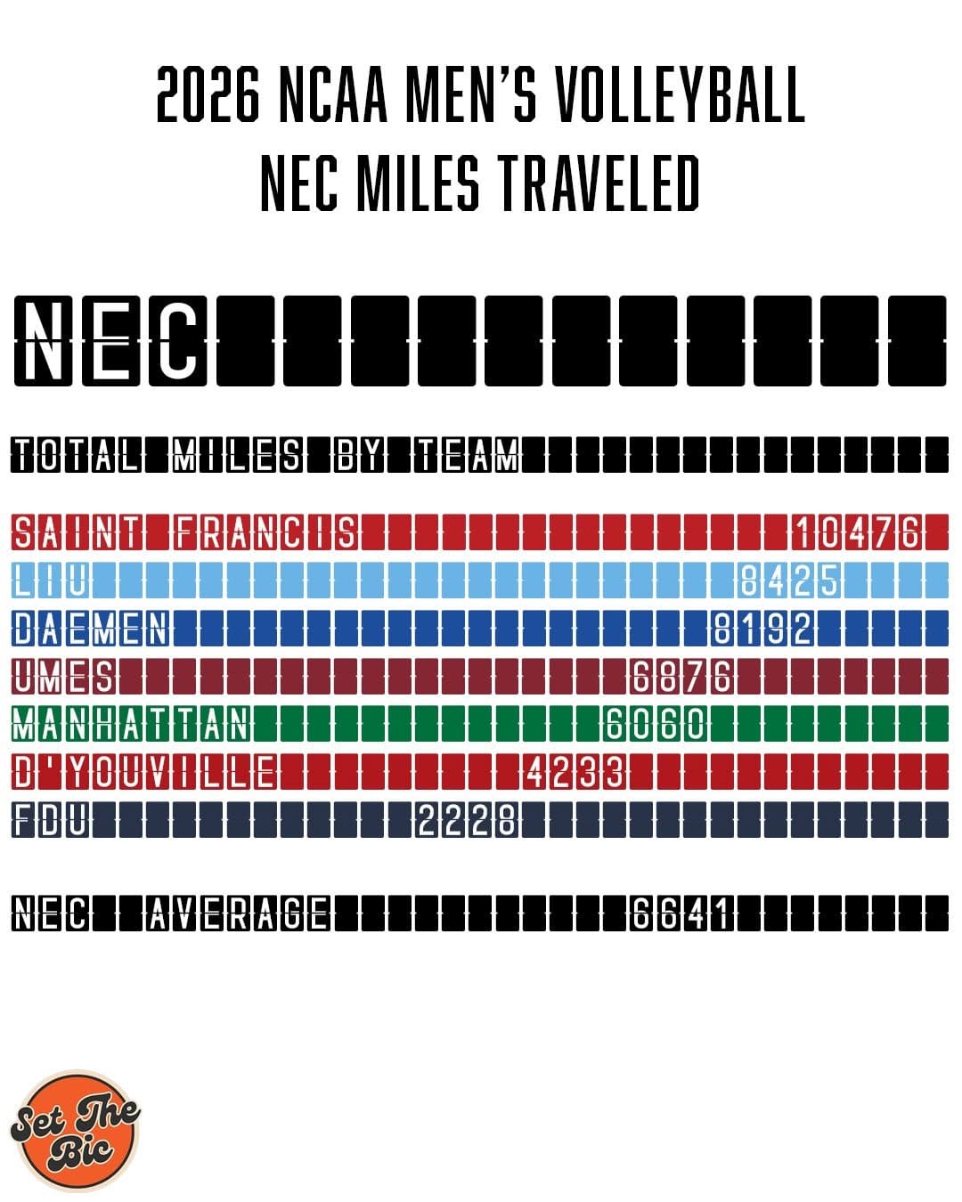
The basis of this chart is a bar chart. Each bar has exposed tiles although they don't have a quantitative interpretation. In principle, the last digit of each data label represents the outer edge of each bar; in practice, it's plainly obvious that the bar lengths do not accurately encode the travel distances. So it's a bar chart in form but not in content.
In the NEC conference, FDU's bar should be about a quarter of the length of Saint Francis's; and about half the length of D'Youville's. But it's not.
I suppose the distances are horizontally dispersed in a way that roughly – very roughly – conveys the ranking of the data.
Is there a better way to visualize this dataset?
In re-thinking the graph, I want to retain several satisfying features of the original:
- The chart form preserves a nested hierarchy in the data: everything > conference > school. It works identically at each level, thus reducing cognitive load moving from one level to another.
- The tiles, colors and fonts suggest a light-hearted, playful mental state.
- The data concern distances.
- Something other than a standard bar chart is desired.
Here's what I came up with:
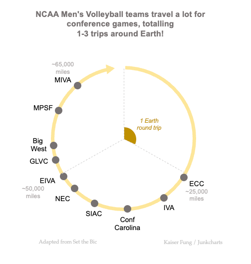
This particular chart shows the data at the conference level. The leagues are arranged around the circumference of a circle. The arrow cues readers to read clockwise from the top. The first conference encountered, the ECC, has the least miles travelled. The conference that does the second-lowest mileage is the IVA.
The distance data are encoded as edge distances on the circle counting from the top. The gaps between consecutive dots represent the differences in travel distance between adjacently ranked leagues.
Next, I added "gridlines" to help readers gauge the scale of the chart. These gridlines are the radii of the circle because the edge distance is proportional to the angle. In deciding the number of gridlines, I took a hint from the original chart, where the designer tells readers that a trip around the Earth is about 25,000 miles. The maximum traversed distance here is roughly 67,000 so I plotted 3 round trips, and three gridlines (at 0, 1, and 2 round trips).
Just to show that this design meets the first requirement above, here is the chart for NEC:
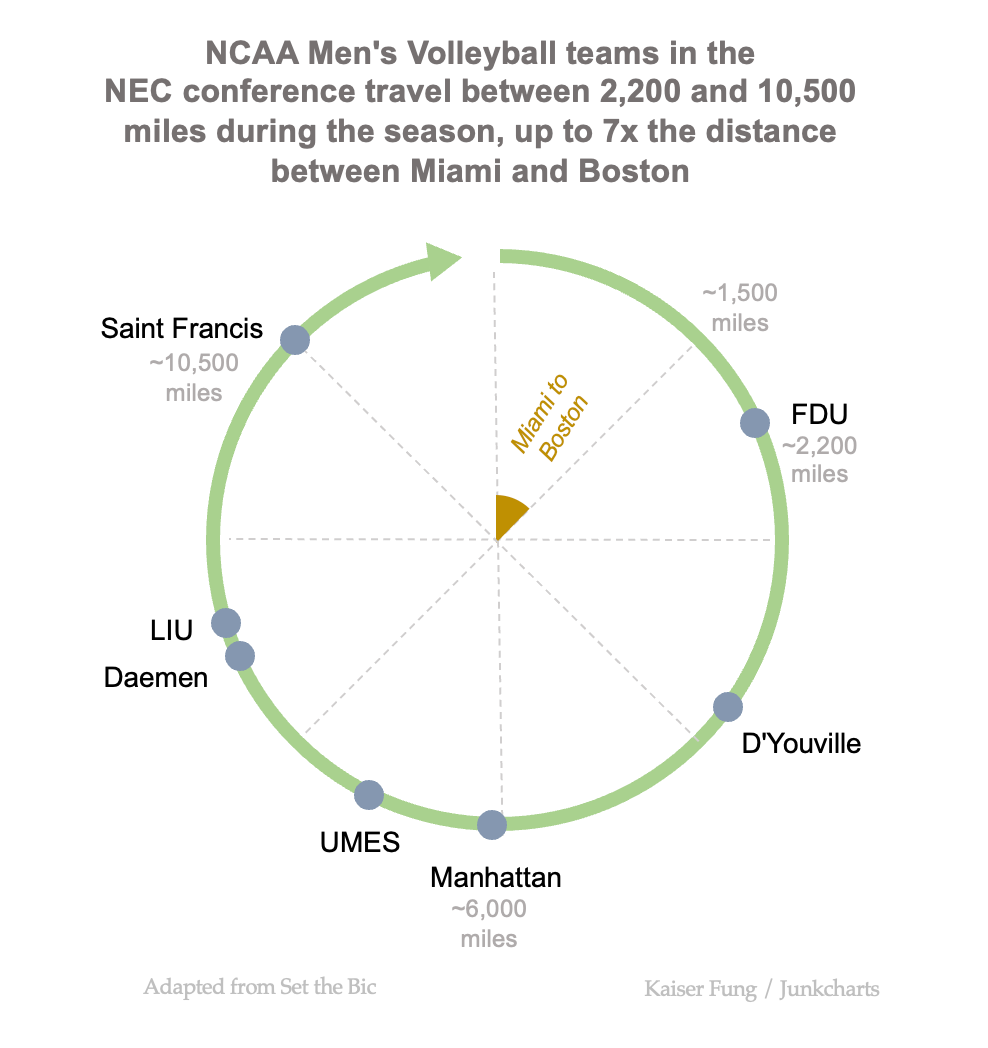
Once the reader figures out how to read one of these charts, the reader has learned how to read all of them.
Last thing... moving back to the D corner of the Trifecta Checkup. What would make this analysis even more compelling is if a "Y" variable (i.e. outcome) is included. How does the variable travel distances affect the teams' performances?