An abstract chart only statisticians love
The NYT made this abstract chart about clouds on full eclipse day
In reviewing the New York Times's visual story anticipating the full solar eclipse in 2024 (link), I skipped over their most intricate chart.
This chart has the handiwork of a statistician. I wonder if non-statisticians would appreciate it.
The line chart looks simple but is very abstract. It is many layers removed from reality. The chart can't really stand on its own feet. It's better that readers see something less abstract first. (This follows Andrew Gelman's advice in his post on the ladder of abstraction.)
Such as this map from the NYT article, which was featured in my previous review (link):
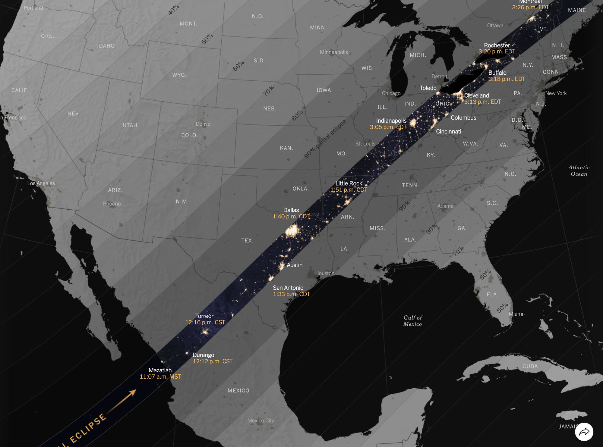
This map is less abstract, showing the outline of North America, and the path of totality running from Mexico through the U.S. to Canada. It also shows the path's width.
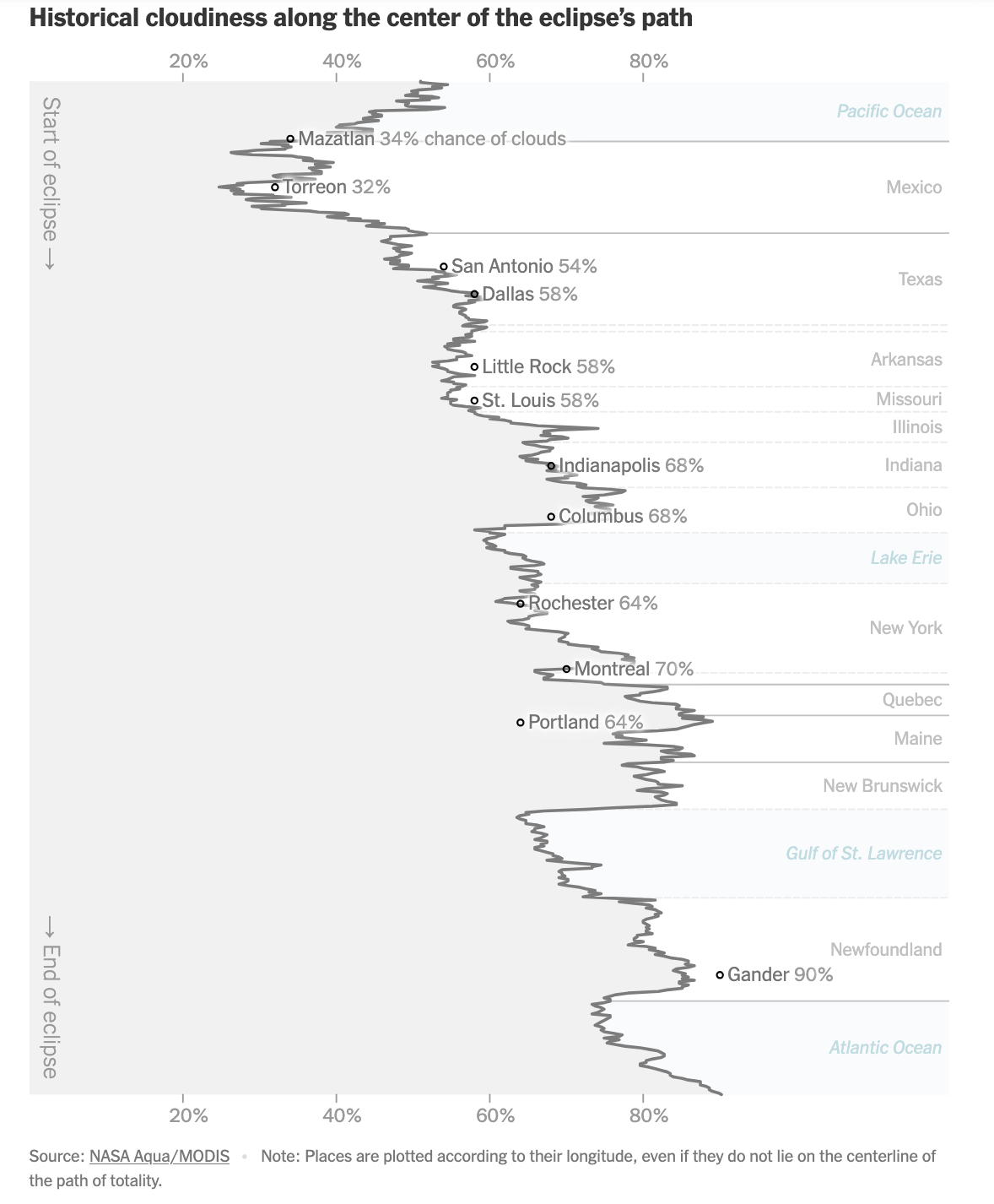
In the statistician's chart, the path of totality has been straightened out and made vertical, running from top to bottom, instead of west to east. As the designer explains, the width has been simplified away, the vertical axis depicting only the center of the path.
The cloud cover data have also been stripped down. The interactive chart shows everything, including areas far away from the path of totality (both in space and in time).
The statistician's chart, once again, pare things back to the bare minimum. At each location, there is a single number for cloud coverage. Presumably, this is the expected cloud cover at the best time for observation in the highlighted region. The shades of gray have become a single percentage.
The point of this line chart is to remove all extraneous information, and make a beeline for the key correlation between cloud cover and space.
Time is also present, insofar as it is coupled with the vertical axis of space.
Statisticians like these types of simple charts that have been cleansed of extraneous information. But we often forget that simplicity begets abstraction.
The basic story of the data is that most of the places along the center of the path of totality would experience very cloudy conditions during the solar eclipse.
That cough I'm hearing may be you hinting at me to get an eye checkup. Will the cloud cover really be that dense since there is still quite a bit of white space in the chart?
It turns out that the right axis line has been curiously erased. As a result, readers may mistakenly take the right edge of the chart as its right axis. In the following chart, I restored the right axis, showing where the cloud cover hits 100%.
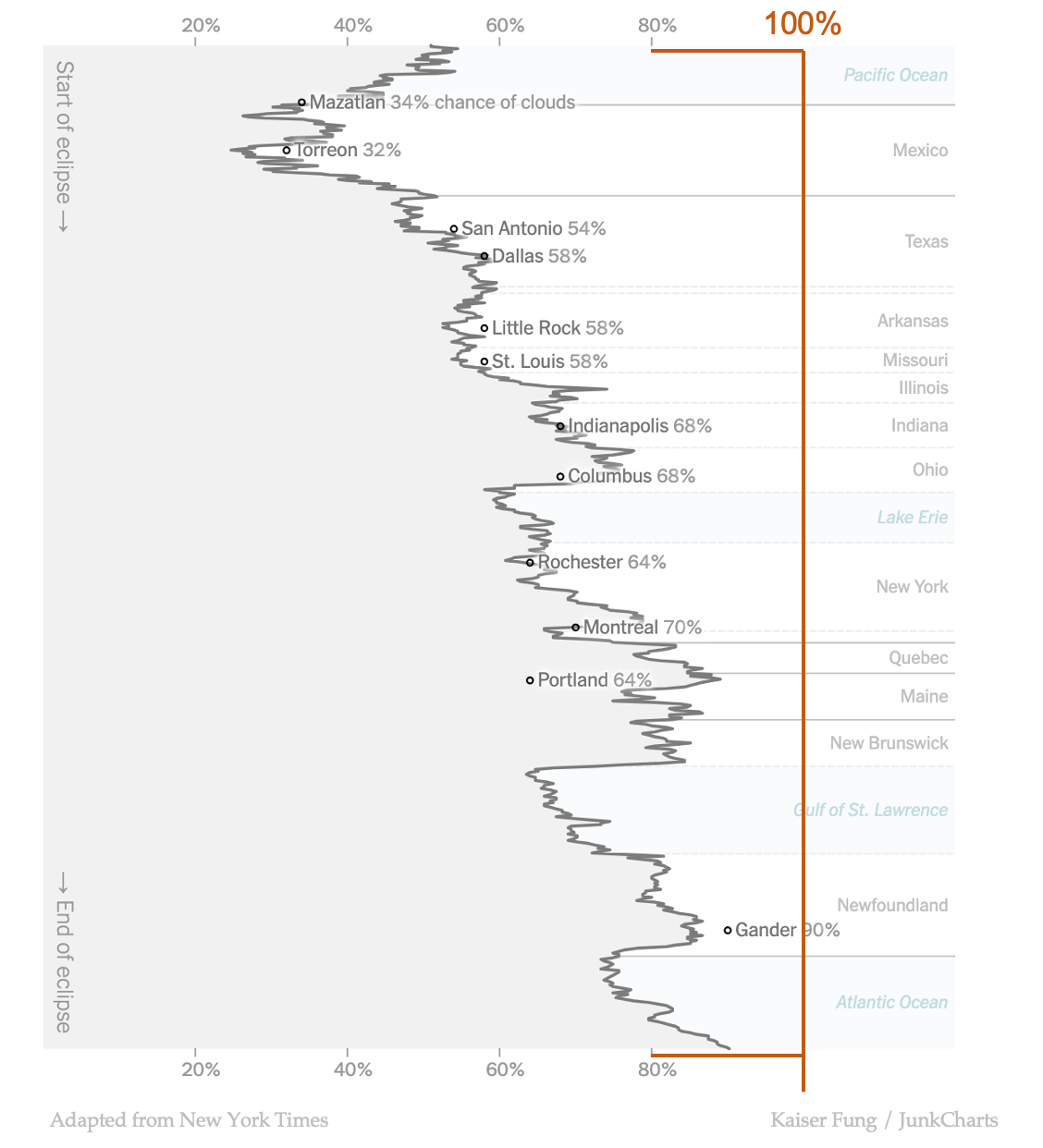
You can now see that the viewing conditions aren't great towards the east coast.
One last thing... if this line chart is your thing, one of the key design decisions is its orientation.
Here is what the chart looks like if we turn it on its side:
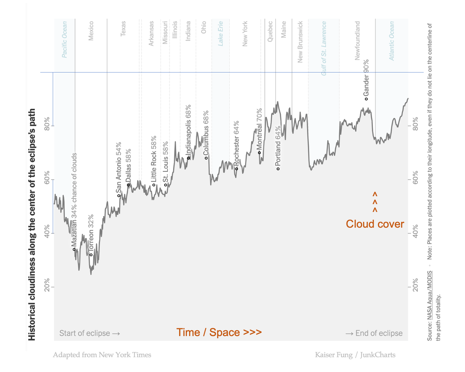
In Western cultures, it's more natural to have time running left to right (as opposed to top down). The path of totality also happens to go west to east which aligns with a left to right orientation. Higher levels of a key metric being shown higher up the chart is also natural.
There is a reason why the New York Times printed this chart sideways. They would rather that we don't have to turn our heads when reading the names of places.
It's a tradeoff. Which orientation would you select?