Definitely not working
Catherine Rampell ponticificated on the nature of working families in the NYT Economix blog recently. Are both members of the family working? Or not working?

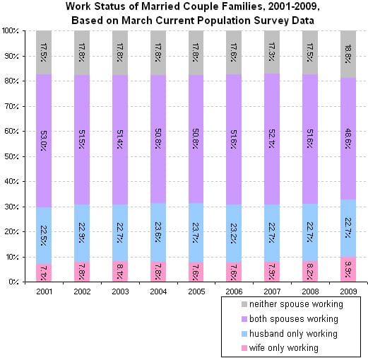
One thing is for sure. Her chart just doesn't work. Too many colors, unnecessary gridlines, should label the series directly in lieu of the legend. Fails our self-sufficiency criterion: once every piece of data is printed on the chart via data labels, everything else is rendered redundant!
And the chart conveys the wrong message! Looking at this chart, the reader would think the message is: the distribution of work status among married couple families has not changed materially between 2001 and 2009. That is pretty much Rampell's conclusion. She said that the gray bar moving from 17.5% to 18.8% in 2009 was "not a huge jump from year to year", and the the pink bar going from 8.2% to 9.9% in 2009 was a "slightly bigger increase".
This unfortunately paints the whole picture. For a start, most stacked column charts can be replaced with line charts like this:
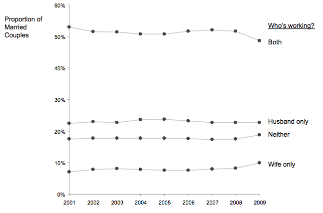
Because the vertical scale is no longer constrained at the upper end, the changes from year to year will appear more magnified in this version. We may think some of the 2009 data to be different from the other 8 years, and we would be right. Sometimes a small change is a big change - because the thing being measured just doesn't vary much. The next chart highlights this:
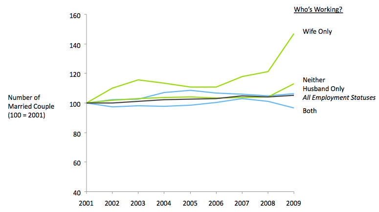
I went back to the raw data, expressed in the number of married couple families, and then created an index, with the 2003 count as 100 for each category. The black line shows the underlying demographic growth in the total number of such families over the 9 years. It's now obvious that there has been a pretty remarkable jump in families with only the wives working.
The difference between this chart and the other two charts is the choice of comparisons. The first two purports to look for year-on-year changes; such comparisons are hard because how big a shift is to be considered noticeable? In the last version, we regard as noticeable a growth curve over time that differs significantly from the underlying growth trend (black line).
More sophisticated statistical tests can also be used to establish whether the shift in distribution is "statistically significant" but I think the visualization is sufficient.
Reference: "Working Families, Not Working", New York Times, Jan 15 2009.


