Mirror images
Maintaining consistency in scales and axes
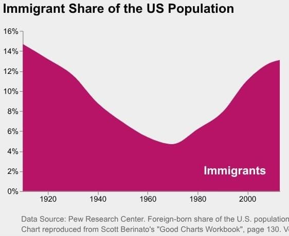
On Twitter, Hans-Jörg Schulz put up a nice example of two charts.
The first chart, shown above, paints a picture of an influx of immigrants into the United States, since the 1970s. We also notice that the proportion of immigrants was similar to the present share if we look back to the 1920s. The trend is U-shaped, first falling, then rising, now reaching a level comparable to a century ago. Depending on one's political views, the message may be alarming or optimistic.
Here is the second chart:
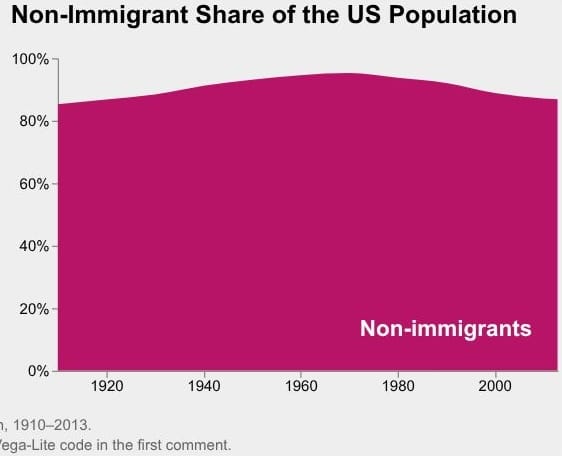
This chart tells a different story. The trend is relatively flat. The proportion of non-immigrants rose a bit then fell back to the level in the 1920s. The reader may think this is a story of stasis.
Of course, the underlying dataset of both charts is identical. Each person is classified as either an immigrant or not an immigrant.
What accounts for the different messages?
The first difference is what's on the chart vs. what's not. The first chart shows the immigrants while the second shows the non-immigrants. Mathematically, the invisible other class is just an inverse of the visible class so it does not add more information; graphically, it directs our attention to one class over the other.
The second difference is the scale. In the first chart, the designer zooms in on the data, showing a scale from 0-16%. In the second chart, the designer takes a long perspective, showing the full scale from 0-100%.
It may be the case that the designer is applying the sensible guideline of starting the axis at 0 when making an area chart.
These two charts illustrate well the problem of having rigid rules of thumb. The range of 0-16% captures the variability of the data in the first chart well. But look at the second chart. The values fluctuate in the range of 80-100%, and yet the axis dips all the way to 0%.
We can flip the first chart, and invert the axis labels to produce a mirror image as the second chart. Like this:
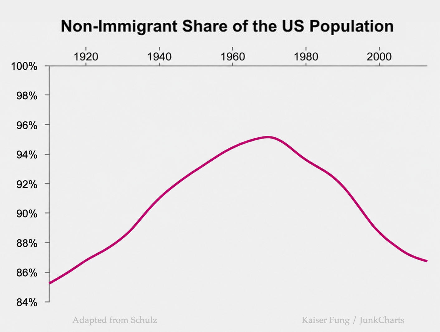
This procedure replicates the scale of the first chart, and it shows what we already know mathematically: that the other class is an inverse of the plotted class.
I switched to a line chart because it doesn't make sense to color the area between the line and the 100% gridline.