Conceptual diagrams that look like dataviz
What is a dataviz?

Long-time reader Chris P. sent in this confusing visualization:
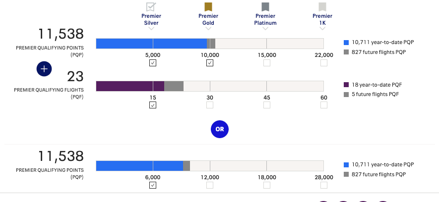
The goal is to depict his progress toward status in the United Mileage Plus frequent flyer programs. Chris said:
United has a great app for managing flights, but then you look at their website and might notice some scale problems (see the 3rd bar in the attached). Suddenly 11,500 is VERY VERY far from 12,000, Argh.
I have to say the diagram contains a lot of information. The design is very flat; almost everything exists on the same plane, making it hard to know where to look.
The data fall into two categories: customer data, and program data.
There are really only two customer metrics: PQP (Points) and PQF (Flights). Each of those is further split by including or excluding future flights. In all, four pieces of data.
All the rest are program data identical across all customers. The four levels of status, and the amount of points or flights required to achieve those.
What is especially difficult to grasp are the alternative pathways to attaining status. In symbols, it's (A1+B) or A2. "A2" is qualifying via points alone, while (A1+B) is qualifying via lower number of points compensated by a level of flights.
If we stare down the Premier Silver column, Chris needs 5,000 Points via path A1+B but he needs 6,000 Points via Path A2. The designer sacrificed common scale in favor of aligning the Premier Silver column. As a result, a blue bar of the same length represents fewer Points on top than in the bottom.
This diagram is more about conveying concepts than data.
I also find the check marks under each bar redundant, prolonging cognition time for little reason. The progress bar - and particularly, the effort to align the status columns - accomplishes the same thing, and better.
Chris sent a screenshot from a different account:
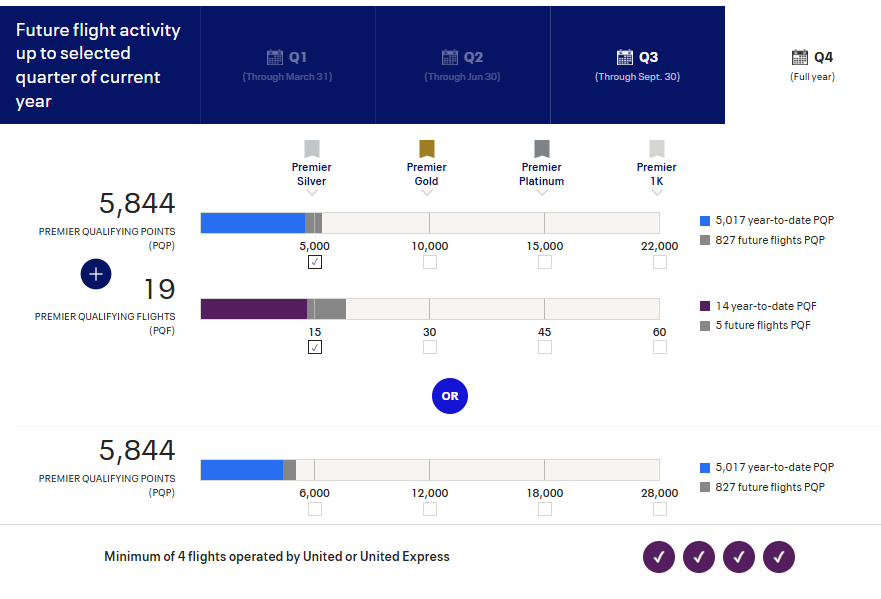
On this one, he observed:
156 PQP is not very close to 6,000.
The third bar is very strange indeed. I took out my ruler. The blue plus gray section is about 85% of the way to the 6,000-mark. But 5,844 is already 97% of the way to 6,000!
Let's go back to the third bar in the first diagram:

The blue bar is about midway between 6,000 and 12,000. That should represent 9,000 Points or so. And yet, Chris had 10,711 PQP at that time. That's about 4,000 above 6,000, and so he should be about two-thirds of the way between 6,000 and 12,000.
This proves again that the diagram is not really a data visualization despite looking like one.