They're coming for your subway stop
Sacrificing for the common good
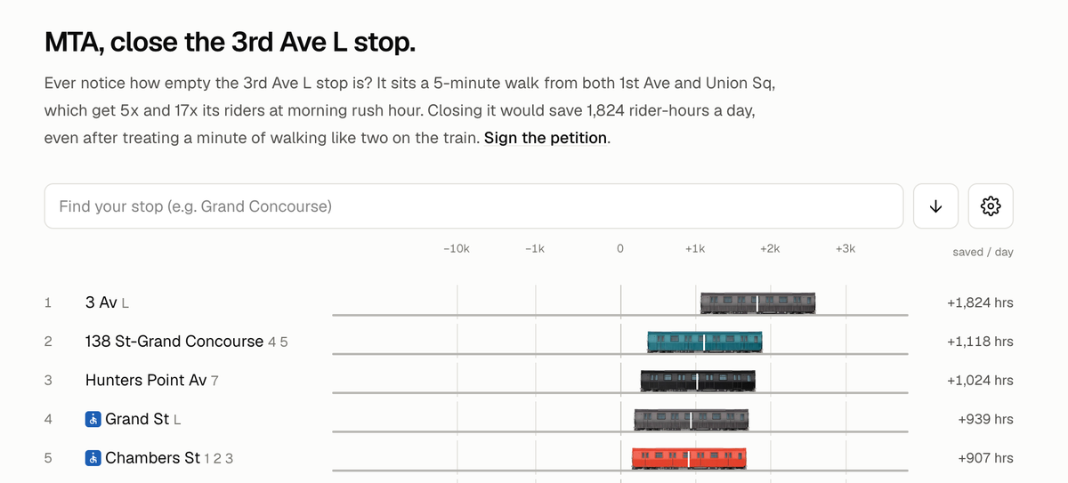
A friend pointed me to this site whose owner (Josh) has started a petition to close one of 356 subway stations in New York.
The station being targeted is the 3rd Avenue stop on the L train that takes commuters from downtown Manhattan into Brooklyn. At least, that's Josh's motivation since he is one of those commuters.
He throws out some scary numbers.
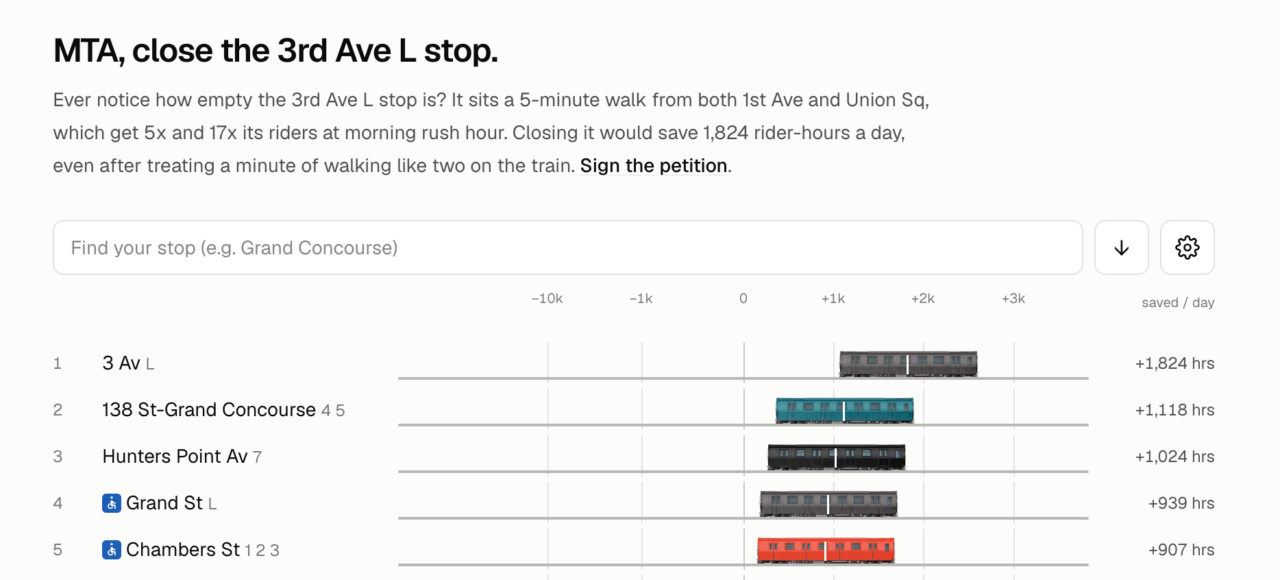
Evidently, over 1,800 hours per day are "saved" if the L train just skips that one stop.
The underlying economic driver is that the 3rd Avenue L stop has relatively low traffic. Only about 6 percent of the riders get on or off the train from that station. At the opposite end of the ranking, we see Penn Station, which is the most popular stop across the entire MTA network.
Josh's analysis is based on public data. The data concern trip origins and destinations so pretty much every time-based item is guesstimated. How much time the train spends at a stop; the additional time spent walking if the 3rd Avenue stop no longer exists; etc.
The following bar chart (found here) summarizes the situation well:
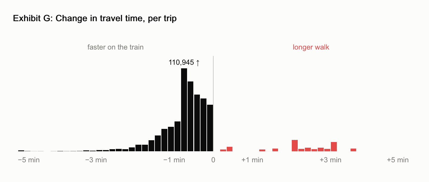
The bar heights represent numbers of commuters that benefit (left side) or suffer (right side) from removing the 3rd Avenue stop. On average, he assumes a train stops at the station for 50 seconds, which explains the peak of the black bars. As we see, the majority of commuters who benefit from one fewer stop only save fewer than 60 seconds on their commute that might last dozens of minutes.
As with many transportation-related problems, there is a feedback loop in operation here. Having been to that stop many times, I'm sure that 50 seconds is an over-estimate of the stoppage time. That is for the same reason why Josh and other commuters want to remove this stop: not many passengers are entering or exiting.
All analyses on the site are based on averages. In my experience on subways, variability matter a lot. At the 3rd Avenue stop, the stoppage time is highly predictable because of low traffic. At a station like Penn Station, one may get extremes because of people trying to squeeze into a packed car, or someone sticking their fingers between the closing doors to force the operator to hold the train. The 50-second saving can quickly dissipate while watching the drama unfold.
Now, let's look at the commuters who are compelled to sacrifice for the "greater good". They are shown as red bars on the right side of the above chart.
The average amount of harm is in the 3-minute range. According to Josh, he doubled the time estimate, meaning that the analysis considers the real-life additional walking time for these commuters to be only about 1.5 minutes on average.
These commuters who use the 3rd Avenue stop would then have to walk to the Union Square stop or the 1st Avenue stop.
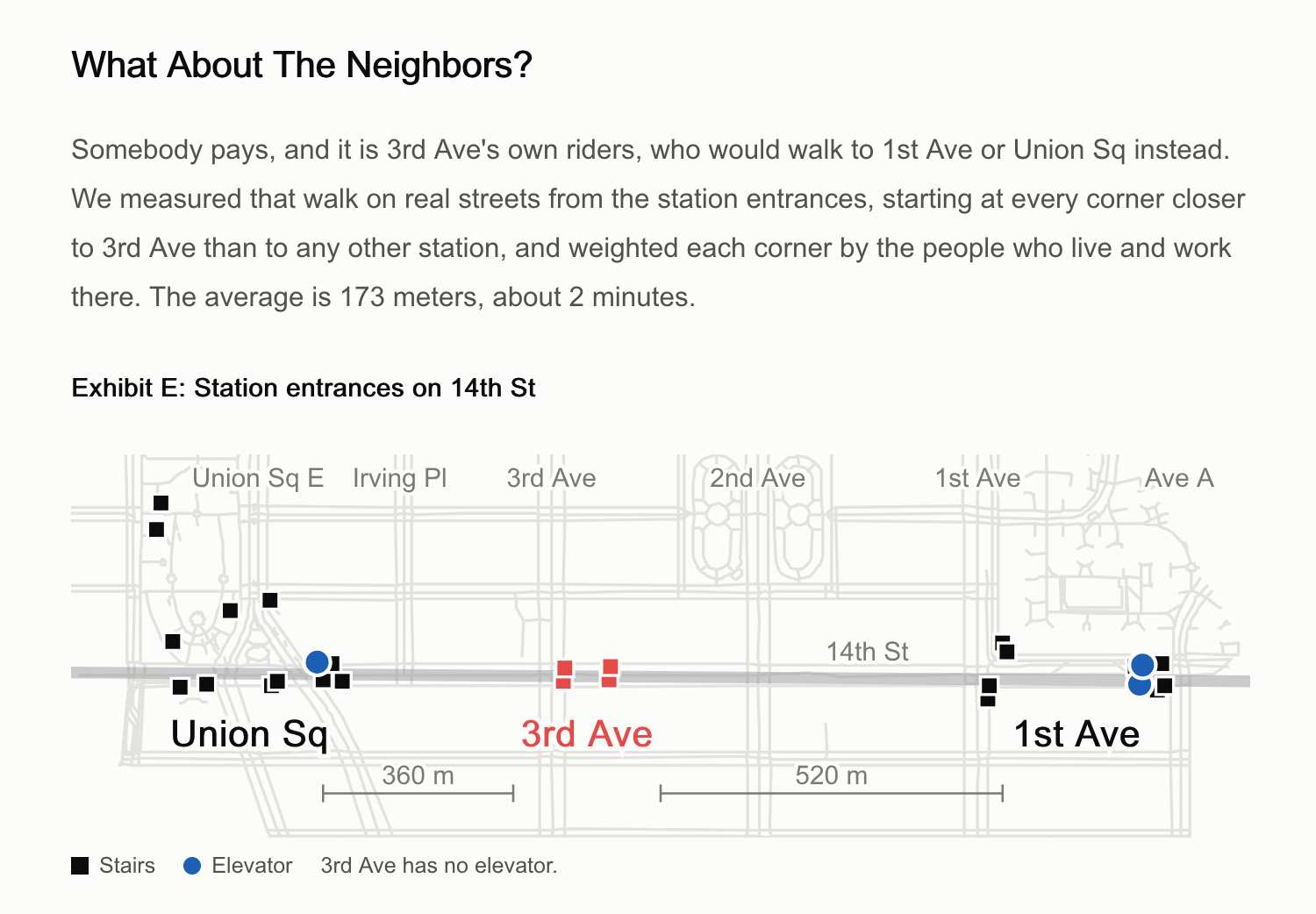
I have trouble digesting this part. He said that the average additional walking distance is 173 meters. The map in Exhibit E indicates that the distance from 3rd Avenue to Union Square (going west) is 360 meters while the distance from 3rd Avenue to 1st Avenue (going east) is over 500 meters. I don't see how someone can walk two long avenue blocks in 2 minutes.
My rule of thumb is 5 min for an avenue block, so two avenue blocks requires 10 minutes. Double that, you have 20 minutes of harm imposed on those commuters.
If someone lives on 14th street, it's a small inconvenience; they might not even have to go full two blocks. But many more passengers are heading to other streets, and they would have to walk the full two blocks. In fact, there aren't many residential buildings between 3rd Avenue and Union Square.
The analytical framework is well thought through. The challenges of working with public ("found") data are clearly illustrated. The analyst has to make a lot of assumptions and guesses along the way, and opinions will differ between analysts.