Directionally correct bars
A concerning new trend
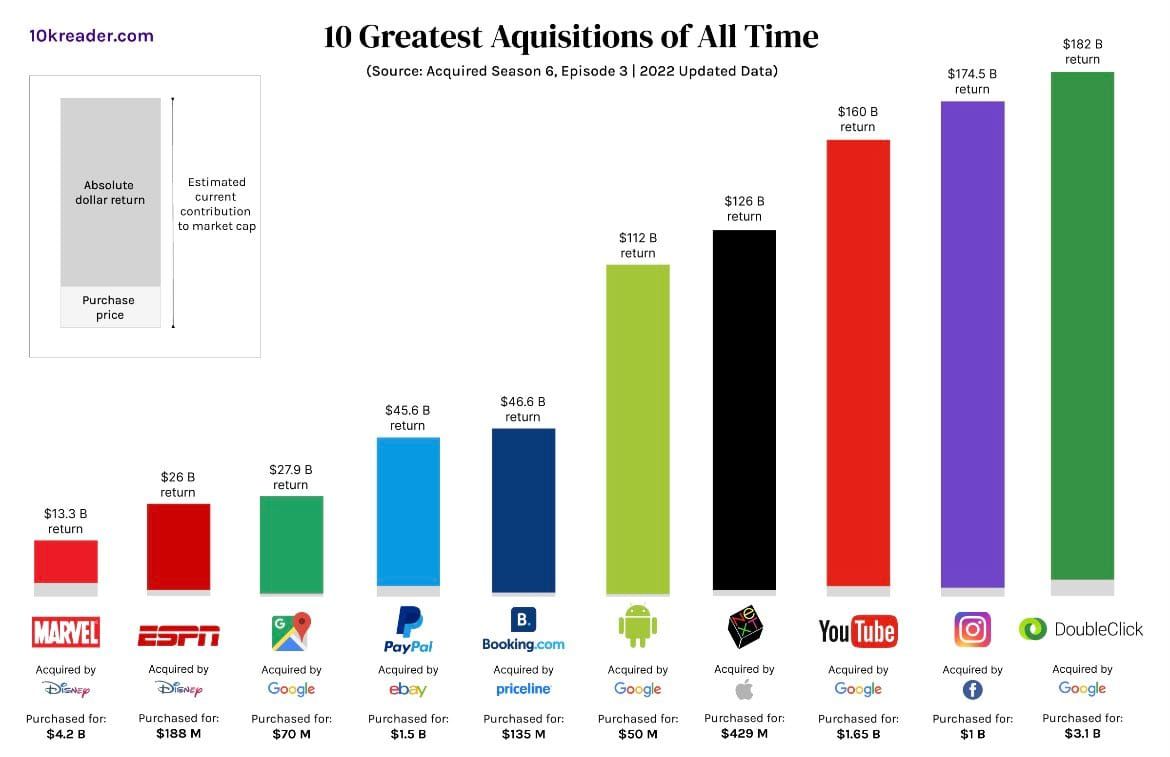
I came across the above bar chart on my Twitter feed. It features 10 acquisitions considered "best of all time" by considering the purchase price and the "absolute dollar return" of the purchase.
Simply said, these acquisitions were well worth the price tag.
From the Trifecta Checkup's perspective, the Question of the chart is clear.
Moving on to the Visual corner of the Trifecta, we immediately stumble upon a vexing problem. The bar heights are not scaled properly.
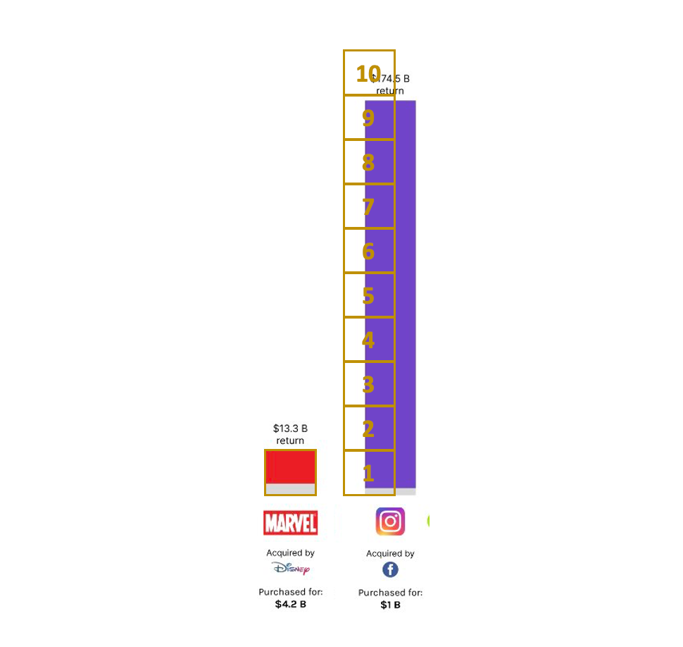
The total height for Disney-Marvel is 13.3+4.2 = 17.5 while for Facebook-Instagram, it's 175.5 so the latter should be 10 times taller. The chart shows the latter to be not quite 9 times taller.
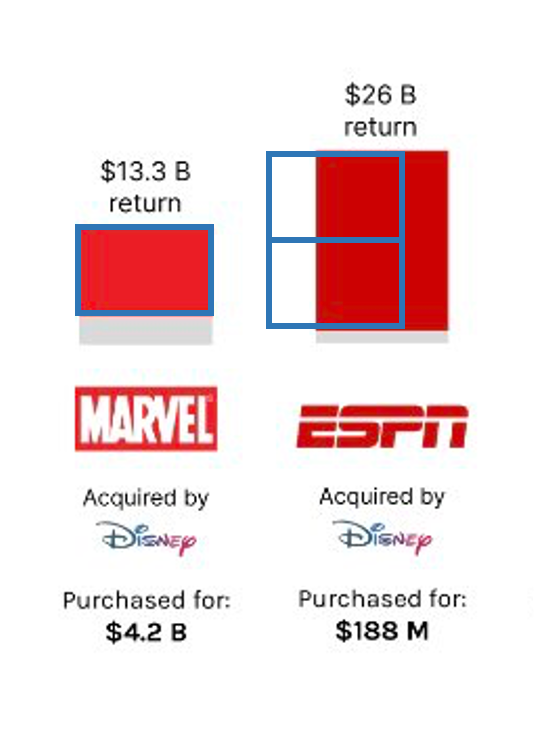
For a moment, I thought the scale may relate to just the top (colored) part of the bars. Disney-ESPN is roughly twice the size of Disney-Marvel by this metric; and the relative heights of the red sections reflect that.
But this observation fails for Marvel vs. Instagram. Instagram's 174.5 billion is roughly 13 times Marvel's 13.3 billion. And yet, the chart represents the height as not quite 12 times larger.
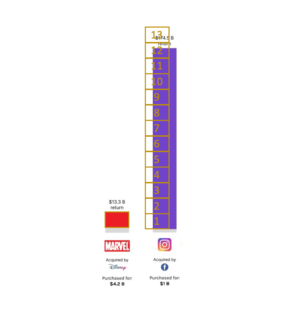
I'm starting to see a lot of charts like this. Even though the chart form is simple, the data have not been properly encoded, distorting the visual representation.
We next consider the Data corner of the Trifecta.
I'm looking at this legend.
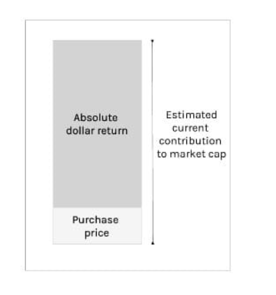
The total height is the estimated current contribution to market cap. One way to get at that value is to take the acquirer's entire market cap, and then estimate what proportion of it can be attributed to the acquired company's line of business. For example, Facebook and Google has many businesses so the acquisition can't claim all of the market cap.
It seems more natural to compute a rate of return, to divide that contribution by the purchase price, instead of subtracting it. For each dollar of purchase price (investment), how many dollars of value have been produced? I suppose the author wants the return expressed in dollars not percentages, hence the subtraction.
A huge amount of uncertainty exists in the estimation of the contribution. For one thing, there are divisions of these large conglomerates that may contribute negative value. The primary observable quantity here is the total market cap. It's risky to focus on just one division, as that might lead to parts not adding up to the sum.
Out of curiosity I looked up Facebook's market cap. It's roughly $2 trillion. So this analyst estimates that Instagram is about 8-10% of the total.