A or B but not both
There is no free lunch
At the recent UN meeting, a resolution was passed to recommend an "Equal Earth" map projection to replace the ubiquitous "Mercator" map projection (link).
The Guardian shows us the two maps side by side:
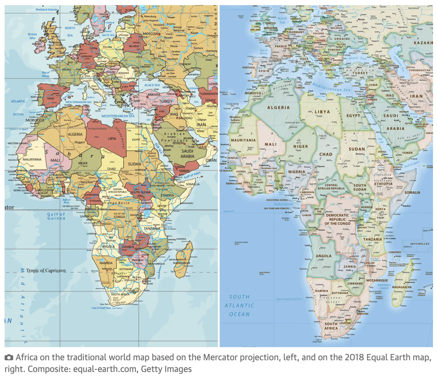
The left-hand-side map looks familiar while the right-hand-side map looks elongated with the African continent "blown up" while Europe, and especially U.K., looks shrunken.
The argument for adopting the "Equal Earth" map on the right is that it preserves areas, i.e. the map does not distort the sizes of countries and continents.
Yes, the Mercator map on the left distorts areas, quite severely the further one moves away from the equator. The Map Distortion Lab has a nice utility that quantifies the level of distortion (link):
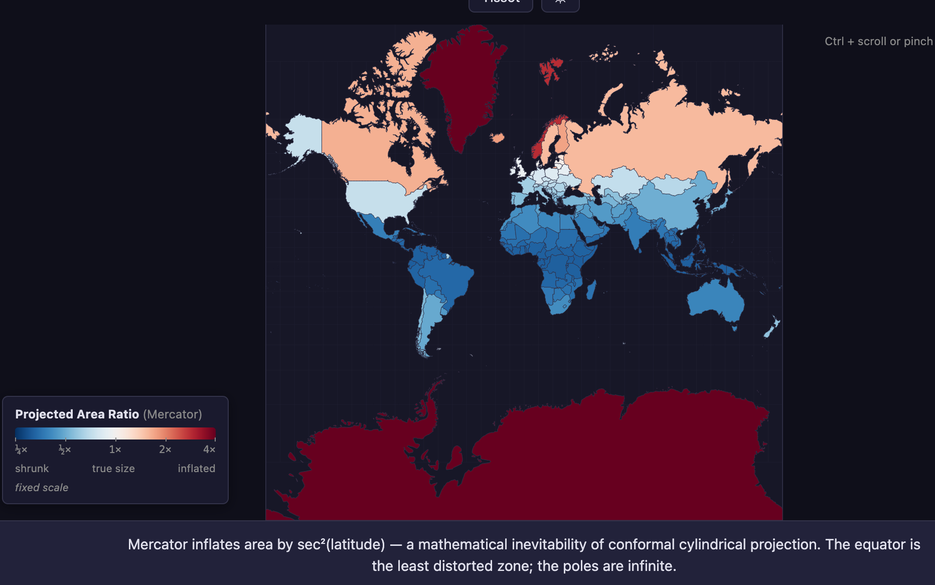
Most of the inhabited southern hemisphere are shown smaller than their actual size while Greenland, Antartica, Canada and Russia are displayed larger than their true size.
Here is the same visualization for an Equal Earth map:
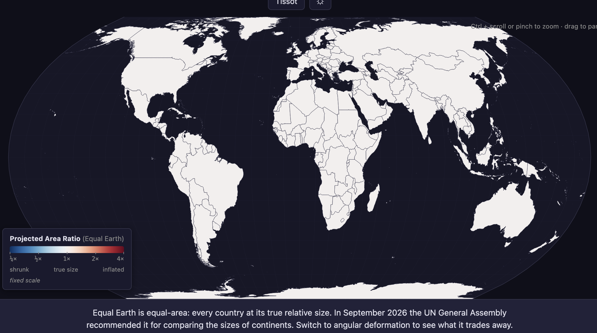
No distortion anywhere as expected, because Equal Earth is an example of an "equal area" map.
As economists like to say, there is no free lunch.
Equal-area maps may truthfully represent areas but they are non-conformal. Non-conformal maps do not preserve shapes. So, the shapes of the countries and continents shown in the Equal Earth map are not their true shapes.
The Mercator is a conformal map. While it distorts areas, the Mercator preserves shapes.
It turns out that one cannot have both! A conformal, equal-area map is impossible.
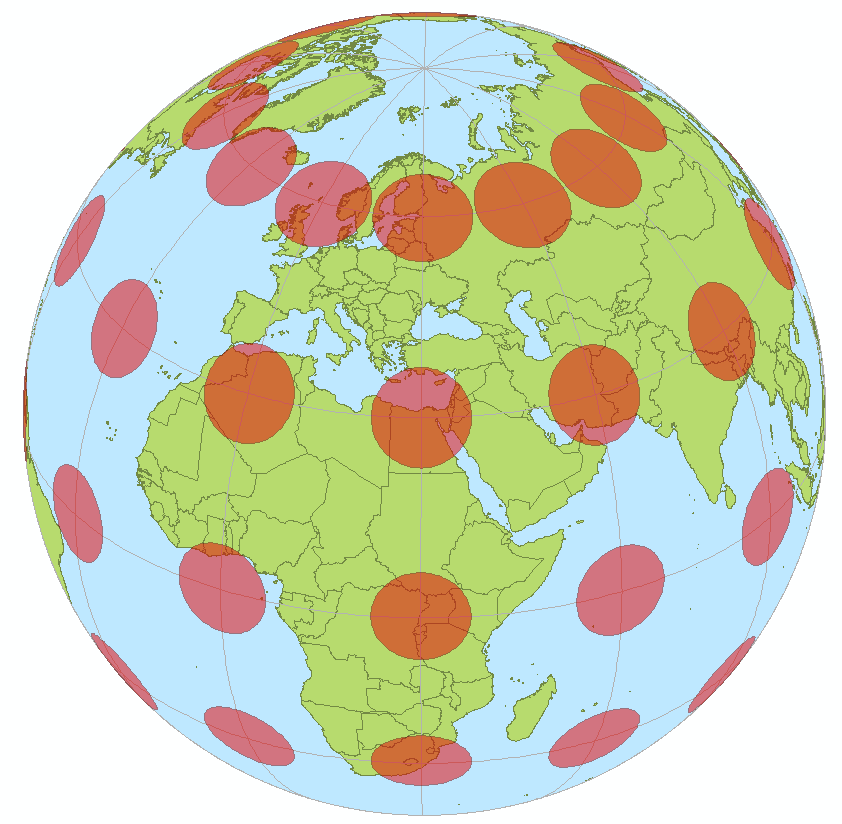
There is an interesting visual tool introduced by Tissot that measures both area and shape distortions at the same time. Start by placing unit circles at the intersections of longitudes and latitudes on the Earth in 3D.
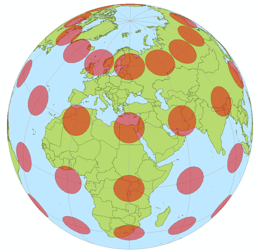
What do these perfect circles look like on different map projections?
For the Mercator:
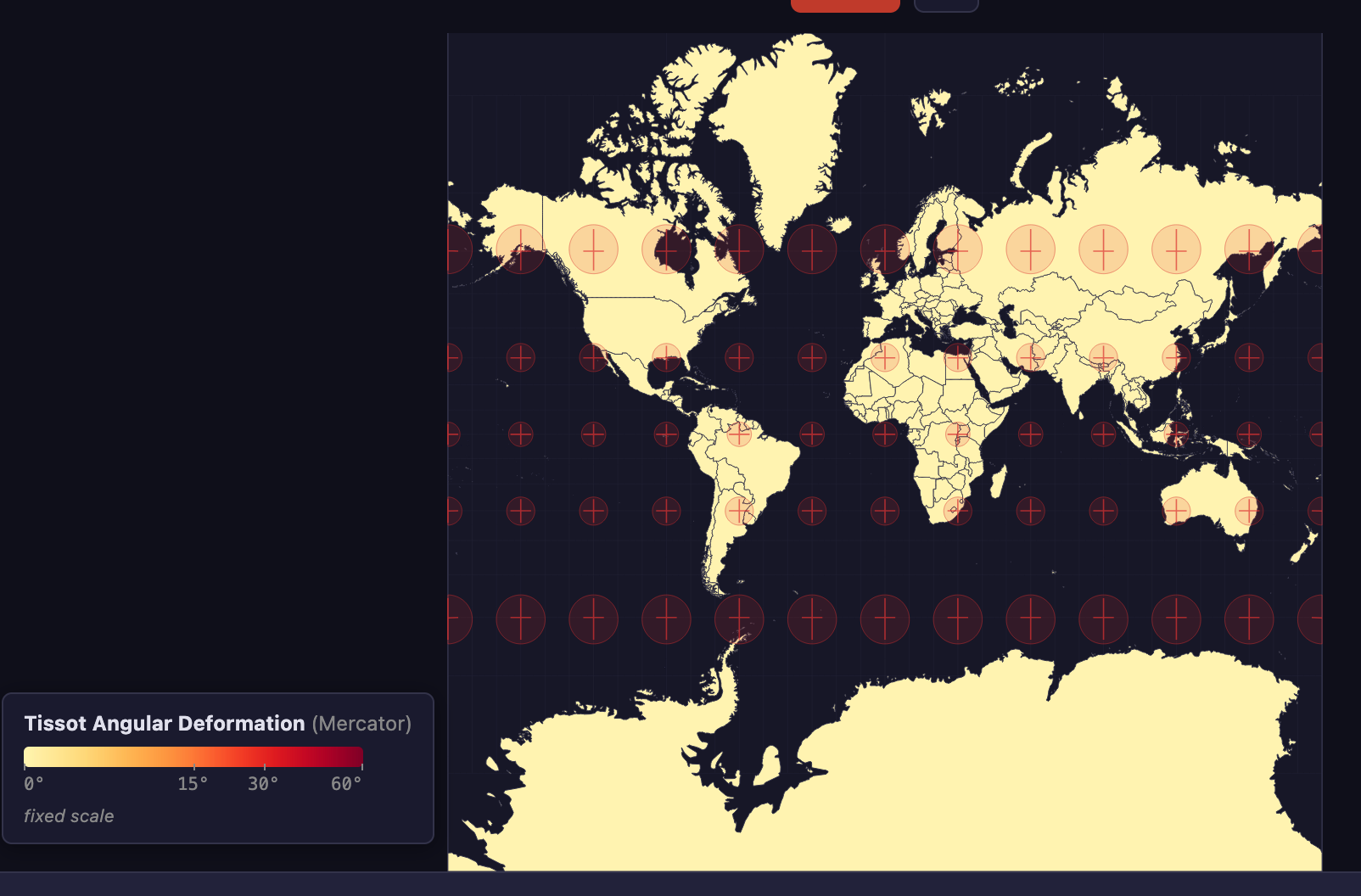
We see a neatly arranged set of cricles. The Mercator projection does not distort the shape of any circle. It does distort areas as we can see that the further the circles are from the equator, the larger they appear.
Now, for the Equal Earth map:
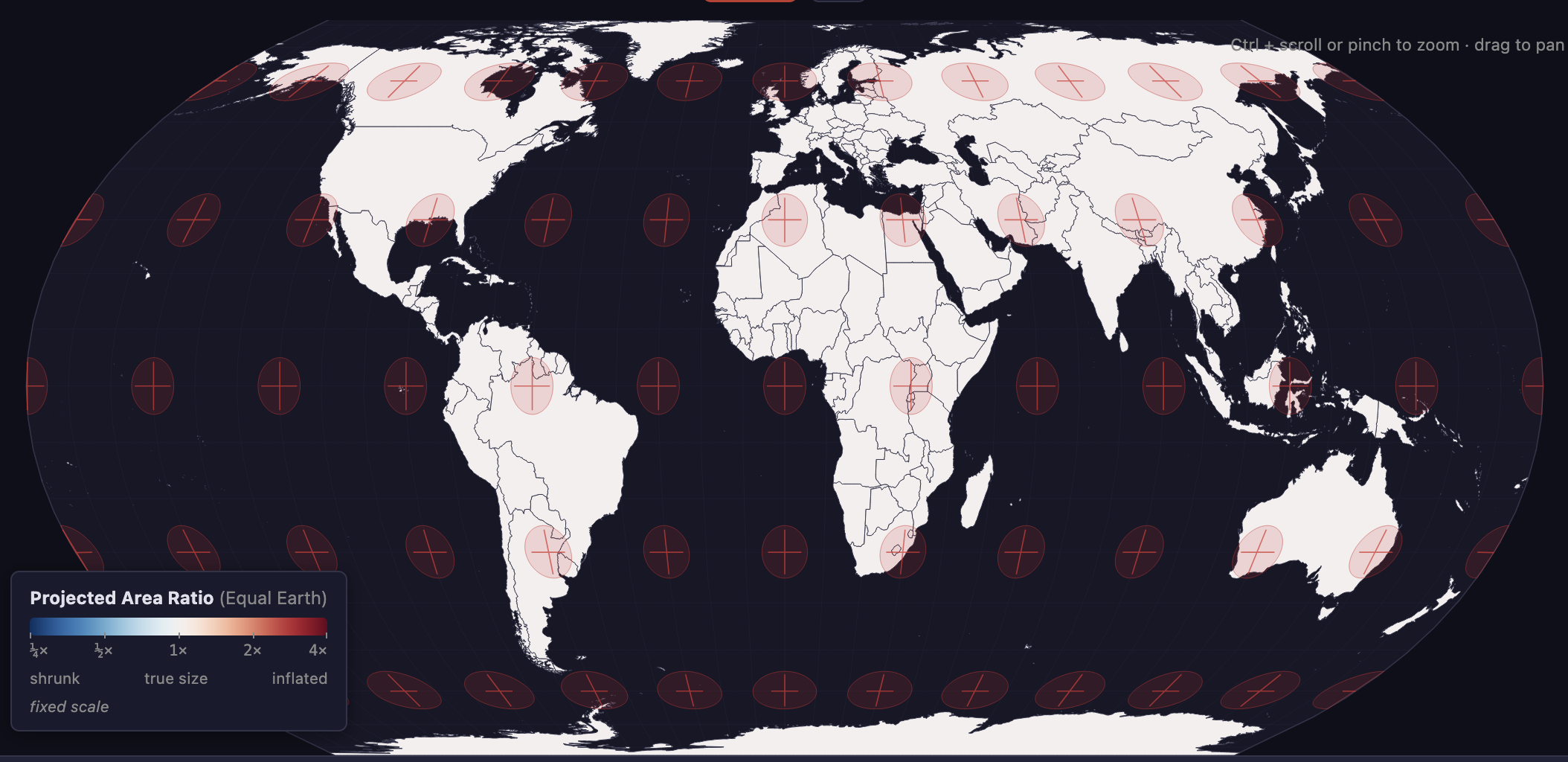
The opposite pattern. The areas of the circles are not distorted but the shapes of these circles have morphed.
Finally, I'll leave you with this tidbit from the Guardian article:
At the session, 164 countries voted in favour of the resolution. Only the US voted no, with its representative saying the resolution was “superfluous”. There were six abstentions.
Perhaps the Mercator will be renamed the Americator?