The art of curation
Design choices and trade-offs

Ben P. wrote me about his project Global Data Tracker (link), which is a website where one can pull data about countries.
In particular, Ben asked me to take a look at the section on forest area.
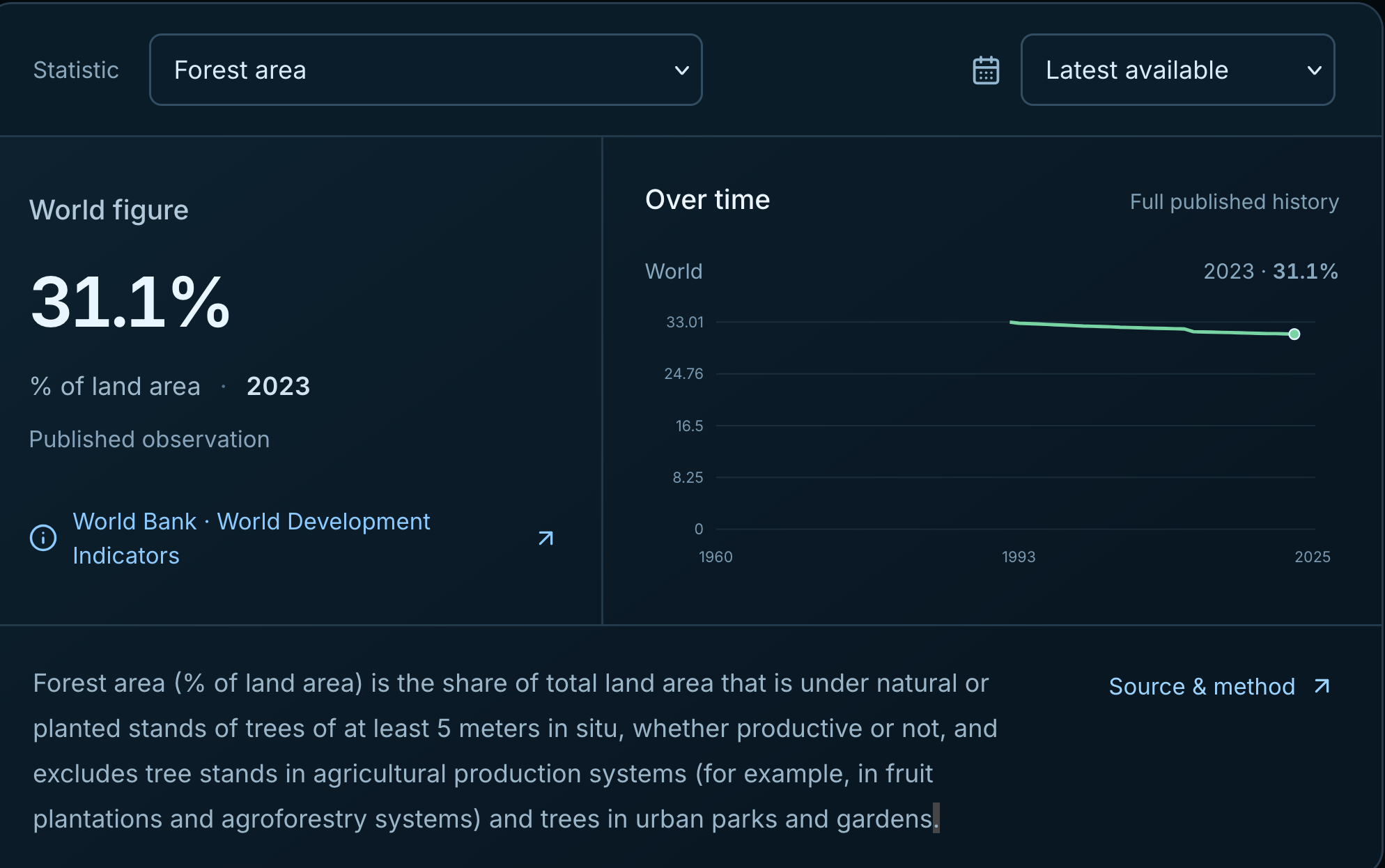
The chart on the right side has the feel of something that came right out of the box. The forest-area series runs from 1990 to 2023, and yet the time axis stretches back to 1960, consigning half of the plot area to empty space. The horizontal gridlines find themselves at awkward levels such as 33.01.
There is also little sense in starting the axis at zero, given that the attained values are far from zero, and the data series moves slowly.
Here is the chart for urban population, for which the data series stretches back to 1960, and the space is fully filled:
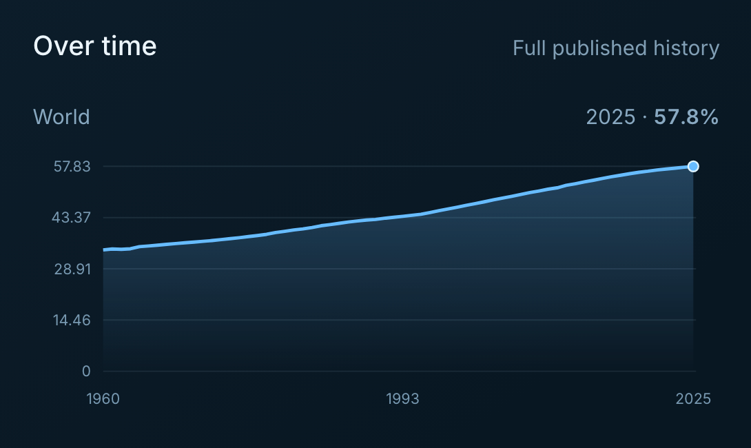
I'm guessing that the design decisions are being set not at the individual chart's level but across a group of charts.
Things then got a lot more interesting. Ben posted a different visualization on Reddit (link) that is derived from the same dataset that contains forest area by country.
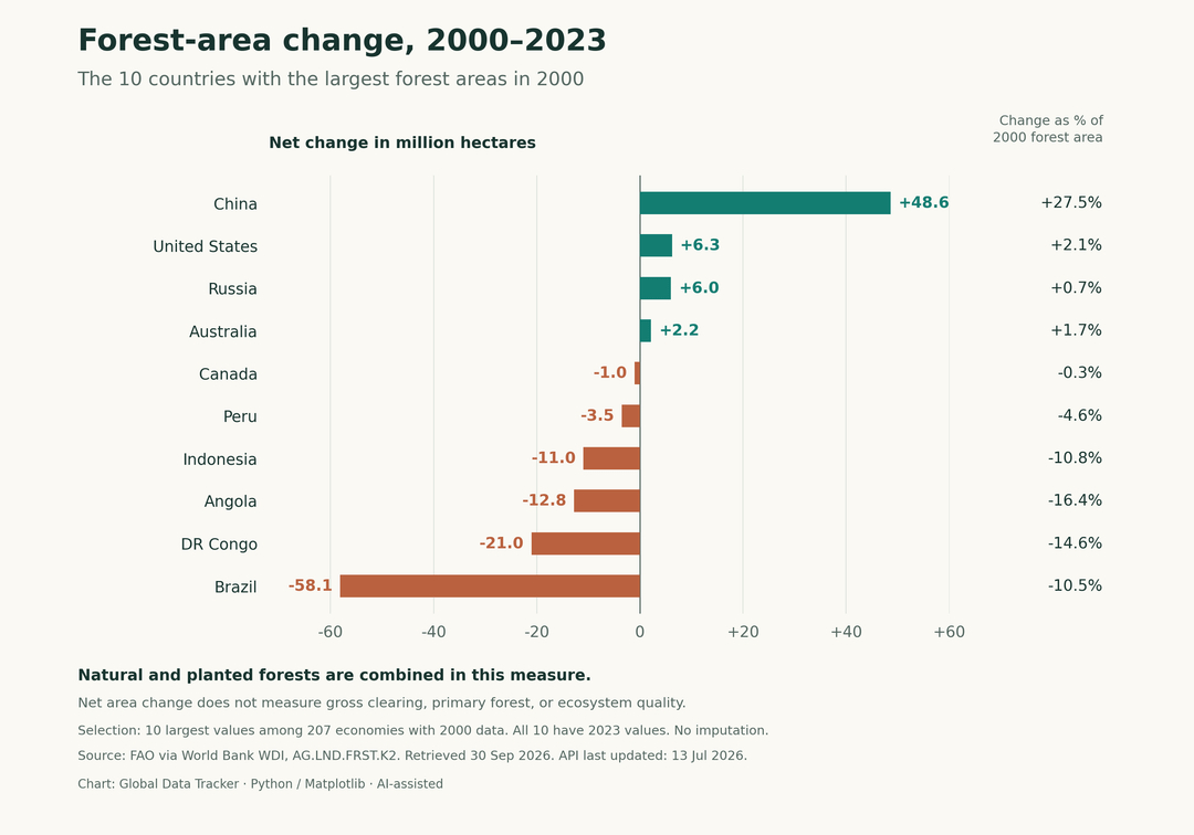
The path from the first chart to this chart is paved with curation.
Instead of computing differences in forest area percentages, this second chart focuses on the change in forest area measured in hectares. The relative metric of percentages adjusts for country size; such statistical adjustment removes country size information from the analysis, which doesn't strike me as wise.
Ben also restricts the chart to highlight only 10 countries, out of a set of over 200.
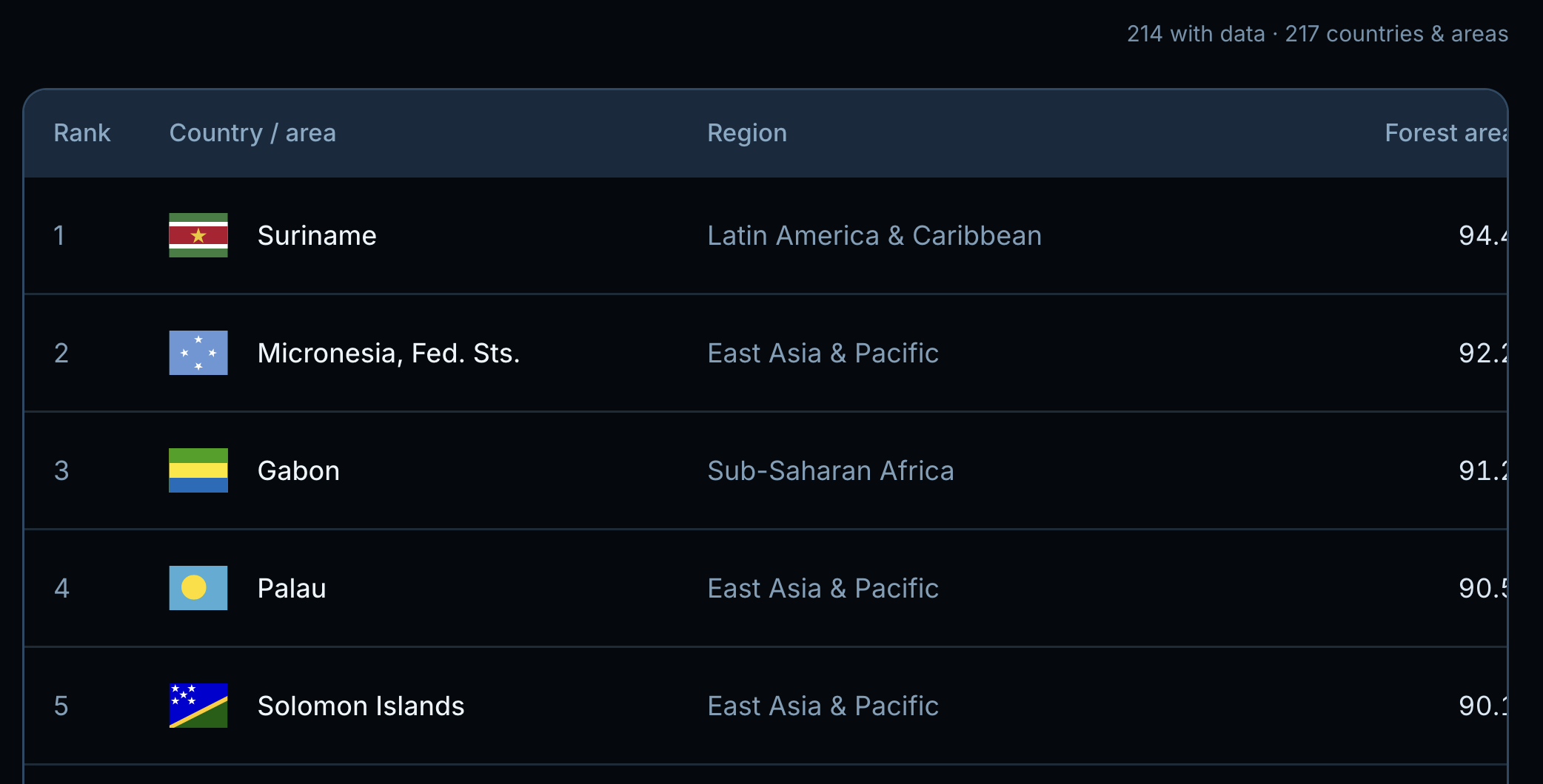
He didn't pick the top 10 countries with the highest forest area percentages. He selected the top 10 countries with the largest hectares of forest area, and then analyzed how that number changed over time.
These choices lead to a very telling chart: about half the countries have increased their forest area while the other half reduced it. China and Brazil stand out, with the former making an extra 50 hectares of forests while the latter eliminating over 50 hectares.
Embedded in that message is another choice, that of the time window for comparison. Ben selected a 23-year window 2000-2023, in so doing discarding the first 10 years of data.
Yet another choice concerns how to order the countries. The chart sorts countries from biggest increase to biggest decrease. It could have been from largest forest area to smallest, the same filter used to select the 10 countries.
Wise choices make the second chart much more informative than the first.
Choices frequently involve trade-offs. A couple is apparent here.
First, by having the bars display the change in hectares, and ordered by the same metric, we no longer know the ranking of forest area by country. We do know these are the top 10 countries but not the specific order.
Second, by focusing on the absolute number of hectares, we don't have the context to interpret their significance, as that requires knowing the proportions. To overcome this issue, Ben places the proportions as a column of numbers on the right of the bar chart.