Cosmetic surgery
Surgically enhancing charts
In this post, I’ll consider the visual aspects of the scatter plot previously featured here (link).
The data concerns cities as units, and as discussed previously, the analytical road is perplexing when the prevailing question concerns people, not subgroups of people known as cities.
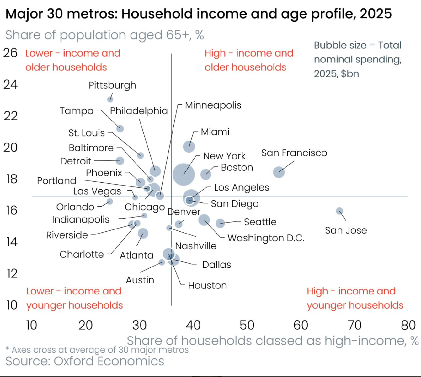
This scatter plot is one of those charts that repel. My eyes want to look away. The reason is sensory overload. The deeper cause is the lack of hierarchy.
Let’s decompose the layers using the visual cues present in the chart.
Layer 1 (red font): the four income-age subgroups [see prior post for why this quadrant labeling is confusing in an analytical way]
Layer 2 (large bold black font): the chart title
Layer 3 (smaller regular black font): city labels and axis labels
Layer 4 (even smaller, dark gray font): bubble size legend on the top right
Layer 5 (smaller light gray font): axis titles
Layer 6 (smallest light gray font): footnote at the bottom left
Layer 7 (guiding lines): every bubble has a line linking it to its city label
Layer 8 (black): axis lines drawn at the mean values of the respective axis
These eight layers are present, and yet the visual differences between them are not sufficiently large that my eyes can’t decide where to look.
In this post, I’m not changing the chart form. I just want to show how paying meticulous attention to details such as font size and font color can vastly enhance the readability of even a poor choice of chart form.
Let’s start with a minimal layout:
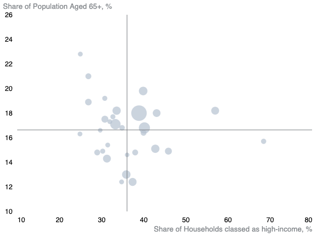
Other than the data, this chart contains only Layers 5 and 8.
Even so, I feel like there are many voices screaming for my attention. The axis labels and the axis lines get top billing because of the opaque black color.
The following version has minor cosmetic changes but our experience of it is different:
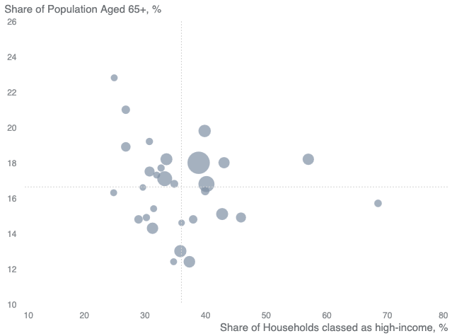
I pushed the data bubbles and the axis titles to the foreground while deemphasizing the axis lines and the axis labels.
I know, I know. It’s annoying to have to swap out all the defaults but it’s well worth the effort.
The design bumps into the same problem of “flatness” when Layers 1, 3 and 4 are added. (These are the red quadrant labels, the city labels and the bubble legend label.)
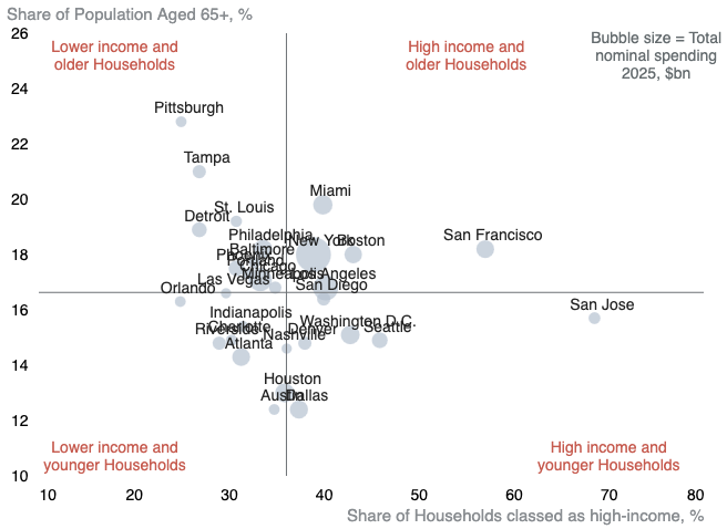
The font size and color are on the same level as the axis labels so all these items are competing for attention.
Applying the previous cosmetic changes helps a bit but not enough:
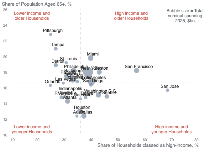
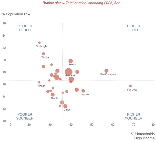
It is inevitably hopeless to put all 30 city names onto a scatter plot. One fix is to annotate only the bubbles around the periphery; the others are close to average.
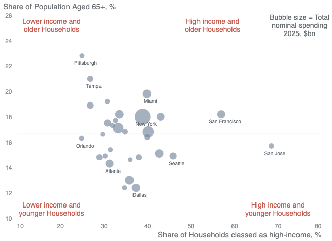
Ideally, what get labeled correspond to key points of the accompanying story.
Observe how the quadrant label on the top right is “displaced” by the bubble size legend label. Another apparently casual edit but quite harmful.
Here, the "Richer, Older" label is restored to its rightful place:
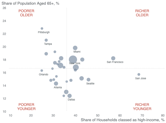
Now, swap the red and blue-gray colors, which has the effect of reversing our attention:
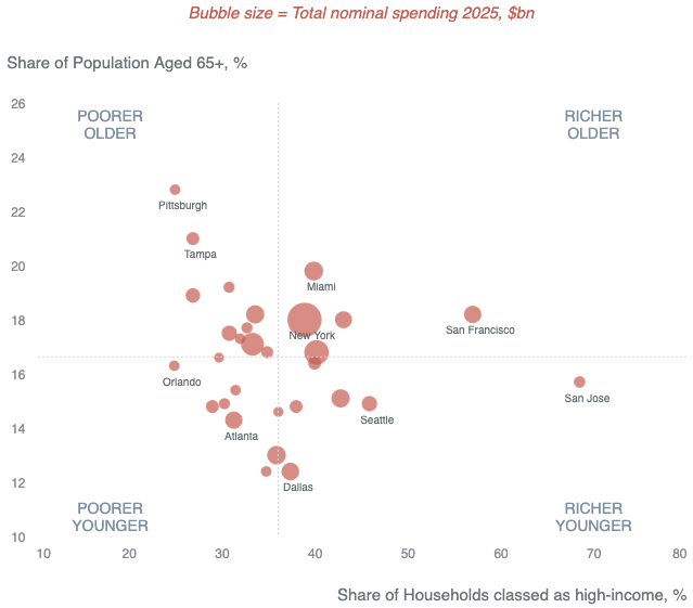
One last thing: the axis titles do not need that many words:
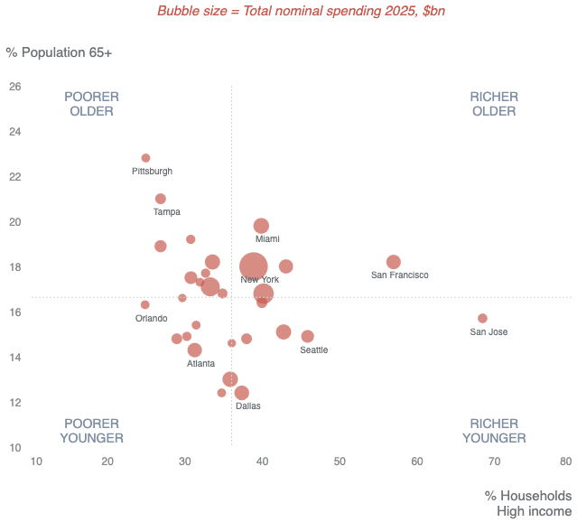
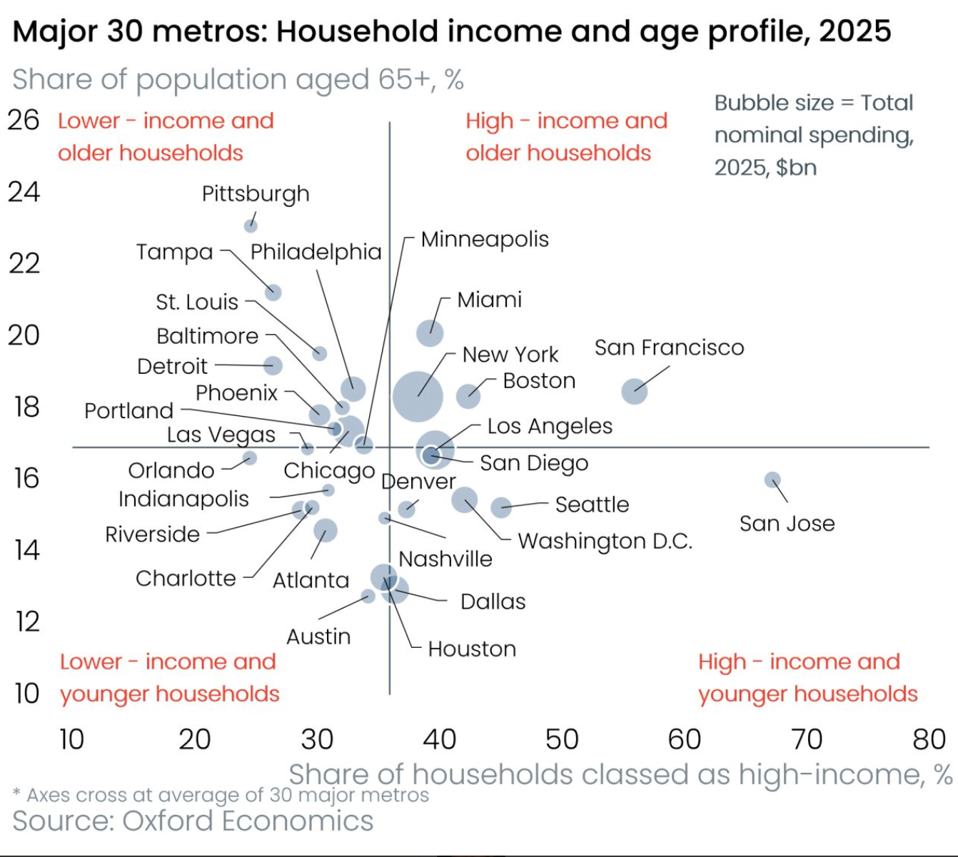
For comparison, this was the original chart with its flat layers: