If you must label people...
A gap between data and question
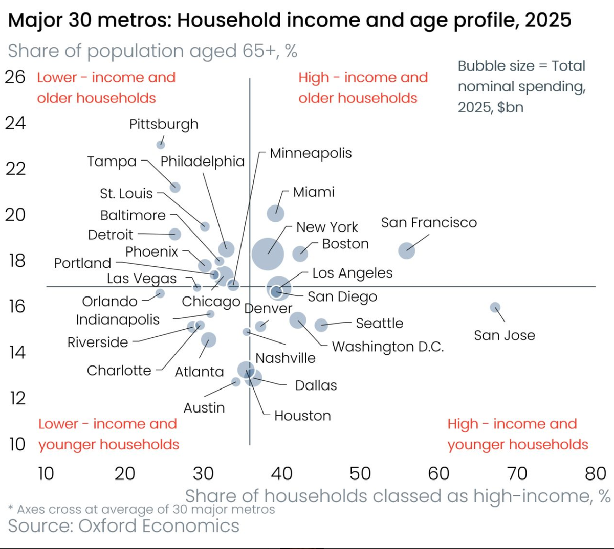
The chart tweeted out by Oxford Economics is made for a Junk Charts post.
Let's address the visual design in a future post. I’d like to focus instead on analyzing the analysis.
Let’s take a tour of this scatter plot.
The two variables being plotted are the share of 65+ population, and the share of “high-income” households. Each dot is an American city ("metro area").
The dot has a size dimension, which maps to the total nominal (i.e. non inflation adjusted) spending in billions of US dollars.
The 65+ proportions range from 12% to 23% while the high-income proportions span 25% to 70%.
Ignoring the embellishments, and studying the x-y correlation, we find a negative correlation: cities with a higher proportion of 65+ tend to have a lower proportion of high-income households.
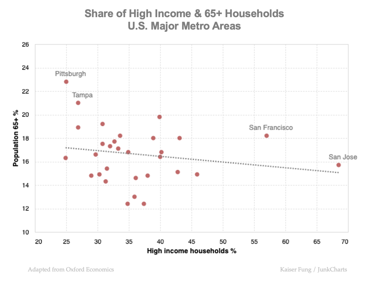
Notice the two potential "leverage" points on the right side, two cities where the majority of households are classified as high income. They are San Francisco and San Jose, at the heart of Silicon Valley.
The negative correlation between household income and age becomes even stronger should we exclude the two Californian cities.
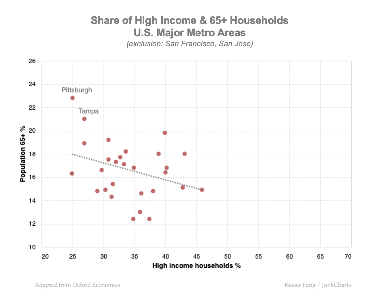
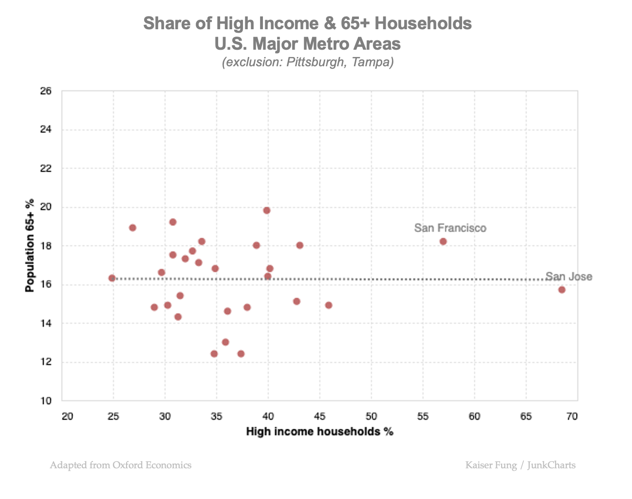
It turns out that two other cities, Pittsburgh and Tampa, have a greater influence on the negative correlation. After excluding them (but including San Francisco and San Jose), the scatter plot shows no association.
I’m not sure why bubble size is total spending rather than total spending per capita. The population of New York metro is four times that of the San Francisco metro (link) so bubble size reflects more population size than propensity to spend.
Now, let’s figure out why the designer divides the space into four quadrants. These quadrants are labeled “high income, older”, “lower income, younger” etc. Each line is drawn at the average value of the axis. So, the cities on the left side of the vertical line have lower than average share of high-income households while the cities on the top side above the horizontal line have higher than average share of older people. The age line neatly bisects the cities into two groups of 15 while the income line splits them 60-40.
I have a beef with these quadrant labels. Take the top-left quadrant with the label “lower income, older households”. Most of the people counted in this quadrant are not "older". In Pittsburgh, the city with the highest share of the elderly, the proportion of 65+ is 23%. The dot in the scatter plot represents the entire city, not just the lower-income, older households within that city.
The four quadrant labels require four different interpretations of the dots. If we shift over to the top-right quadrant, we are supposed to think of the dot as encoding the high-income, older households. But in San Francisco, for example, only 18% of the population are 65 and above; and over 40% of its population are less than "high income".
If each dot were a household, the labels would fit. In this chart, each dot are millions of households, most of whom are mis-labelled.
The entire story of the scatter plot can be reduced to the following matrix:
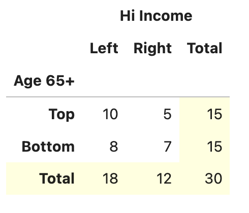
With 30 cities, a random distribution should put 30/4 = roughly 7 or 8 cities in each of the four possible income-age classes. The observed counts are not that far off. One could say the top row is evidence of not completely random (10:5 vs 7.5:7.5).
If we accept the marginals (the sub-totals in yellow), in particular, that cities are less likely to have above-average "high income" share, and that cities are equally likely to have above-average 65+ populations, the expected counts would move from 7.5:7.5 to 9:6. This accounts for most of the bias. We don't have much evidence that the income and age dimensions are correlated. Of course, the numbers are small, making it hard to draw strong conclusions anyway.
We've arrived at the Q corner of the Junk Charts Trifecta Checkup. We have gathered the data; what is the question that we intend to answer?
The context of the so-called K-shaped economy in which U.S. consumption growth is concentrated to high income groups while people with low incomes suffer.
But our discussion has precious little to do with this question. Instead, the visual analysis enabled by the scatter plot concerns whether cities with more high-income people are likely to also have more older people.
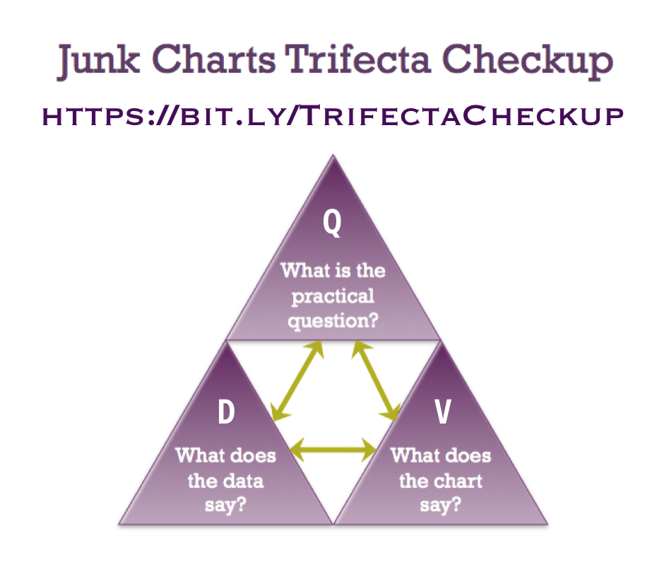
This mismatch is a breakage in the green arrow between the Q and the D corners of the Trifecta Checkup.