Junk Charts
About
RSS
Posts by Year
Posts by Keywords
Sign in
Subscribe
junkcharts
Bar chart
Pushing U.S. leftward, in a way
A simple edit
Map
Maps of Top X
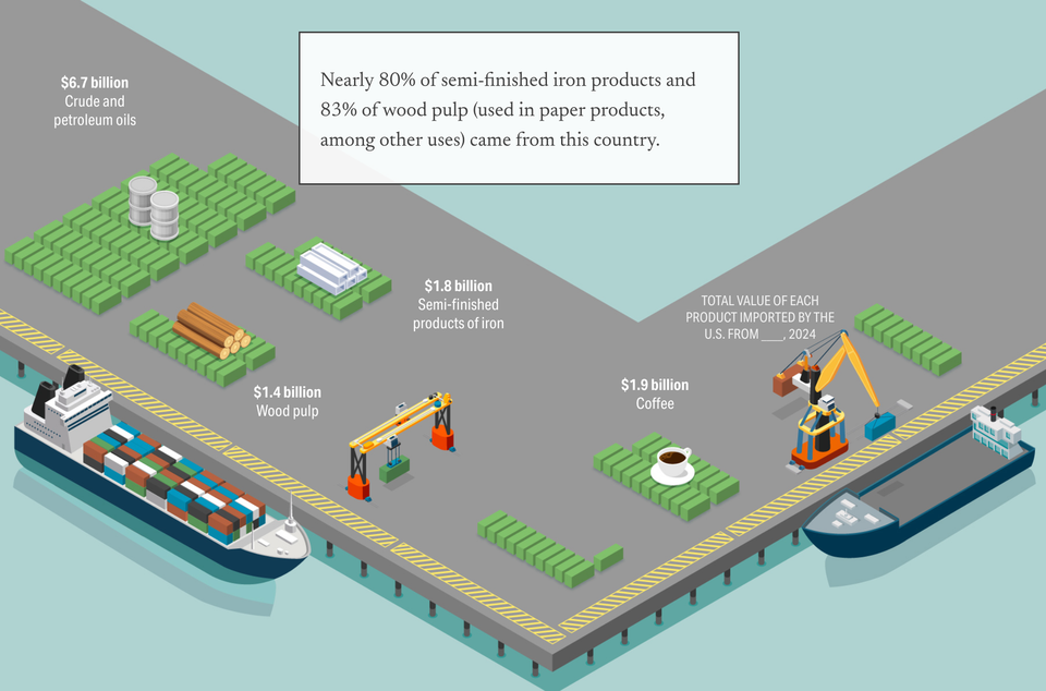
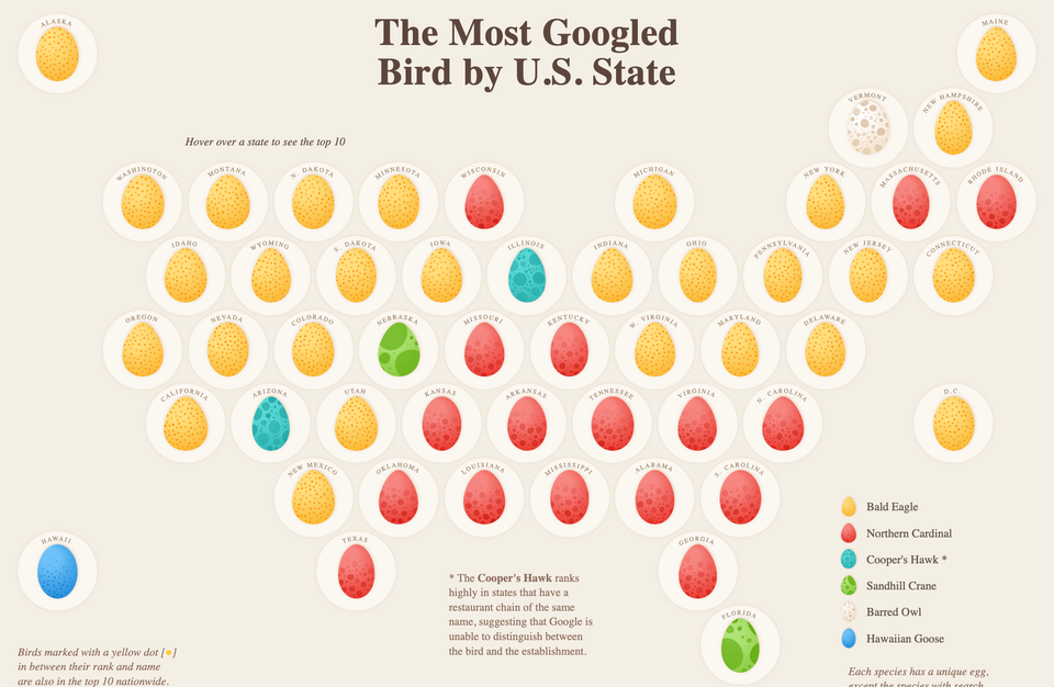
Exploring a popular way of making maps
data visualization
Notes on Webby nominees
Which data visualization project is best of the year?
distortion
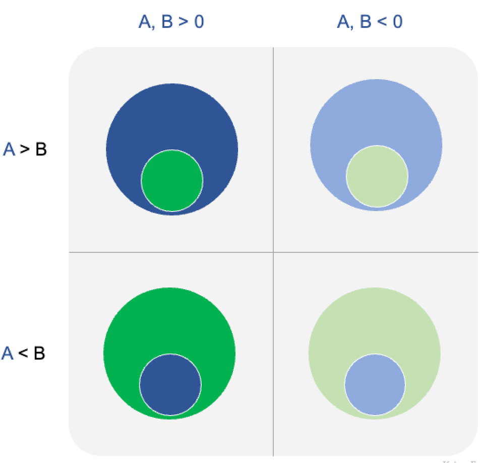
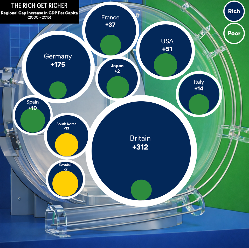
The paradox of circles
You can't have it both ways, no you can't
Bubble chart
Guide to using pairs of circles
A discussion of some design decisions
measurement
Getting metrics right is half the battle
Learning from some student projects
←
Newer Posts
Page 2 of 63
Older Posts
→