Junk Charts
About
RSS
Posts by Year
Posts by Keywords
Sign in
Subscribe
junkcharts
sports analytics
Making sense of long data sequences
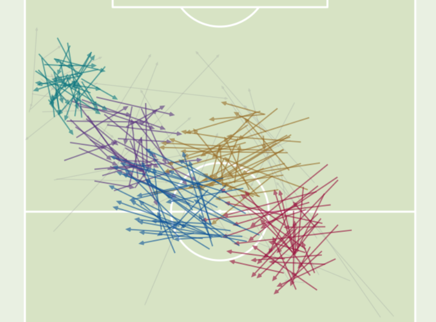
Visualizing football tactics
Sorting
The greatest nations on earth
How you compare to others
line chart
Rearranging deck chairs
A recipe for improving data visualization
Politics
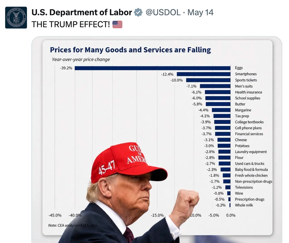
With editing power comes responsibility
Using and abusing
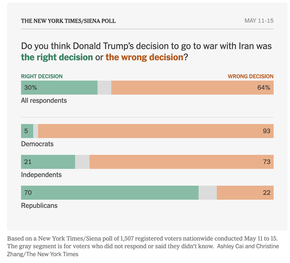
Bar chart
Some good bars
Efficient and effective
Environment
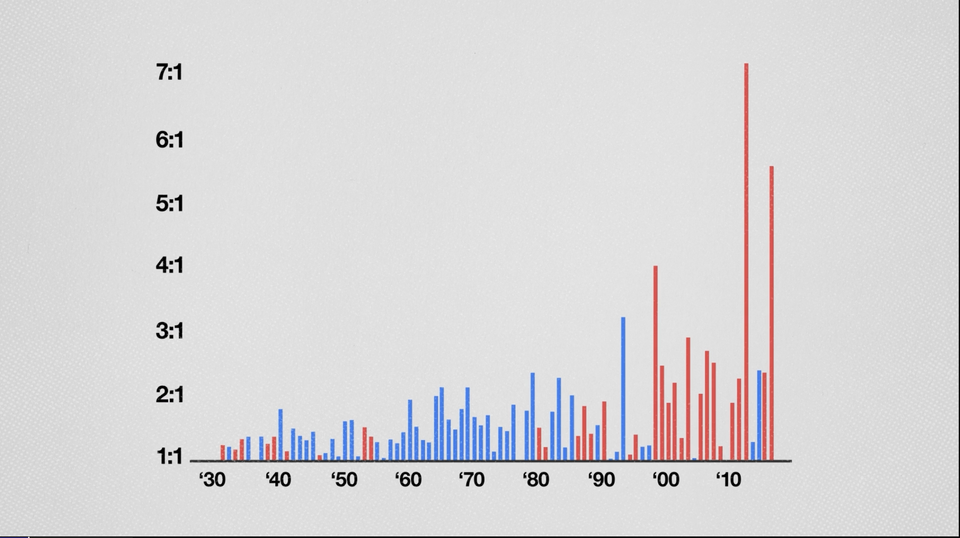
The climate chart that sparks a count v ratio debate
Also the null hypothesis
Page 1 of 63
Older Posts
→