Junk Charts
  • About
  • RSS
  • Posts by Year
  • Posts by Keywords
Sign in Subscribe

Small multiples

Simple presentations
Axis

Simple presentations

In the previous post, I looked at this chart that shows the
Read More
Gaining precision by deleting data
Current affairs

Gaining precision by deleting data

How to gain precision by deleting data
Read More
Fantastic auto show from the Bloomberg crew
Bar chart

Fantastic auto show from the Bloomberg crew

Bloomberg Graphics put on an auto show
Read More
the wtf moment
Bar chart

the wtf moment

the wtf moment in dataviz
Read More
Election coverage prompts good graphics
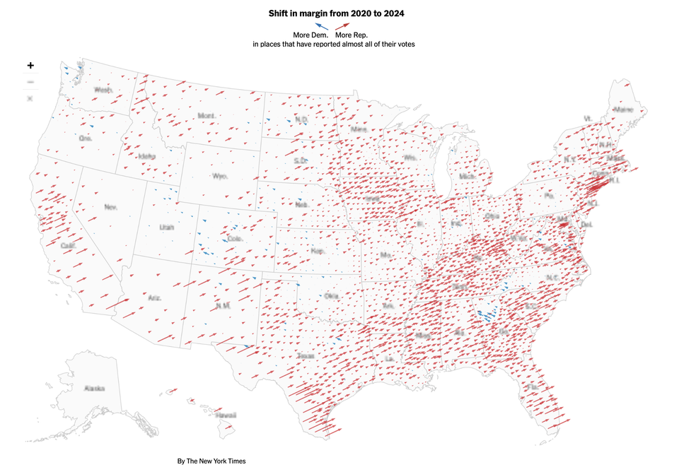
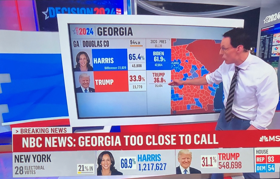
Aggregation

Election coverage prompts good graphics

Election coverage brings out the best of interactive graphics
Read More
Using disaggregation in dataviz
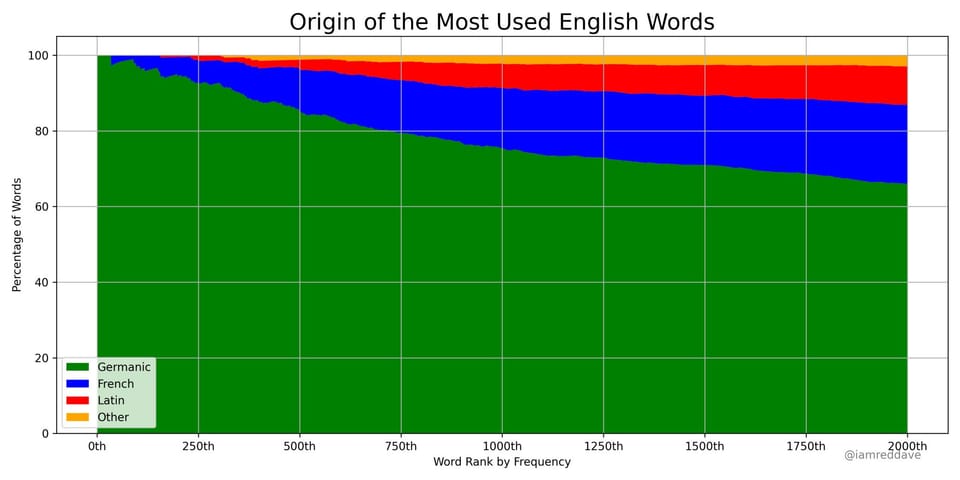
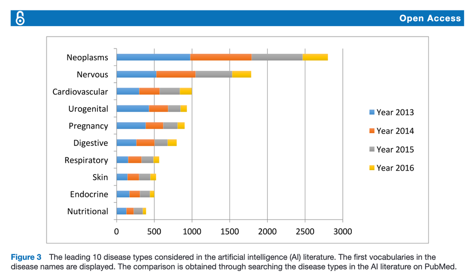
Aggregation

Using disaggregation in dataviz

Disaggregating data can be very useful when making charts
Read More
← Newer Posts Page 2 of 8 Older Posts →
Junk Charts © 2025
  • BOOKS
  • COURSES
  • PRESS
  • CONSULTING
  • COACHING
  • CONTACT
Powered by Ghost