There is a time and a place for every shadow and cloud
A beautiful NYT project masterfully handling time and space dynamics
The New York Times published several beautiful pieces related to the solar eclipse in April, 2024. Let's take a look at one of those articles (link).
They started with a simple map that quite remarkably captures the main reason for intensive media interest at the time.
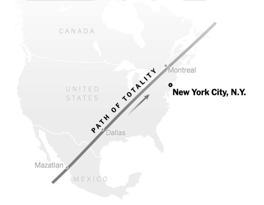
This map draws a "path of totality" that swipes across the U.S. from southeast to northwest. The residents of those regions will experience total solar eclipse. Importantly, a time element is lurking beneath, represented by the arrow. Several key cities along the path are shown.
The map is simple but not too simple: it provides the minimal context for readers to interpret the much more complicated charts below.
***
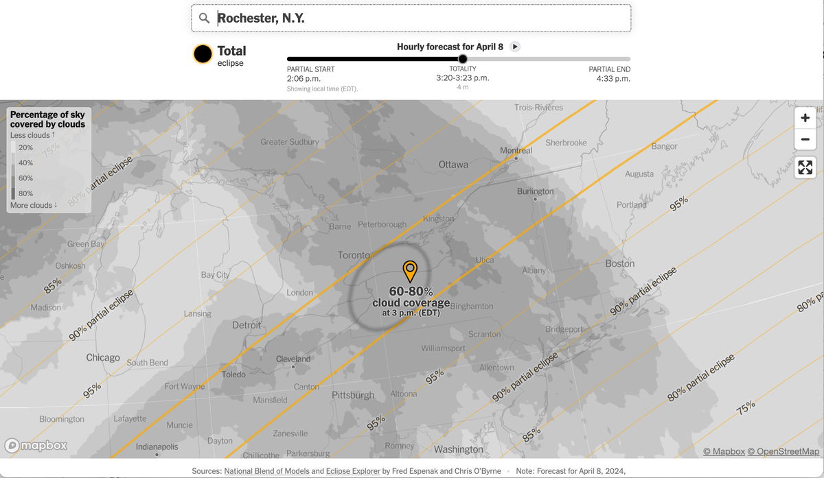
For the moment, I switched my focus to Rochester, NY, which is right in the middle of the path of totality. People were flocking to these areas at the time in order to witness the rare meteorological event. One potential party spoiler is visibility, measured by cloud cover. This is the pivot of NYT's data visualization project: producing a graphic that merges where one is and how much cloud there will be.
I have already mentioned the crucial role of "time". When a path of totality is depicted as a line through the map of the United States, it is as if everyone along the path sees the same sky. The following map, scanned from a different NYT article (here), adds the missing time element:
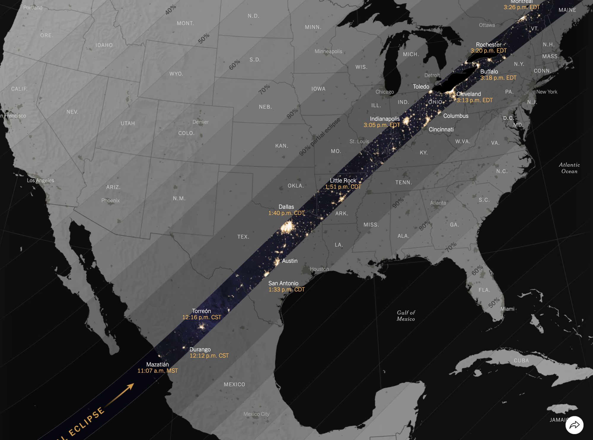
Two things are happening at once. First, the time window for observation varies as the shadow of the moon shifts across space. Second, each location uses its own time zone. On the augmented map above, the key locations are also labeled with an observation time expressed in local time.
Now comes another dynamic element - cloud cover also moves. To address these issues, the NYT team deploys a dynamic map.
The slider above establishes the location, as well as the relevant time window for observation, expressed in local time. The midpoint of the slider is the best time for viewing, and it recenters for each location (and so does the map).
As you move the slider back and forth, you can see the shadow of the moon shift across the map. That really is the whole game - what is the predicted cloud cover right when the shadow passes by one's location?
The slider controls two variables at once. Not only is the shadow of the moon moving but the cloud cover is also morphing.
The cloud cover is a choropleth, using darker colors for denser clouds. That's intuitive.
All in all, I like this project a lot, and appreciate the fantastic effort that made it possible.
A couple of decisions merit our revisiting.
Further down the article (link), I was really excited when I saw this legend:
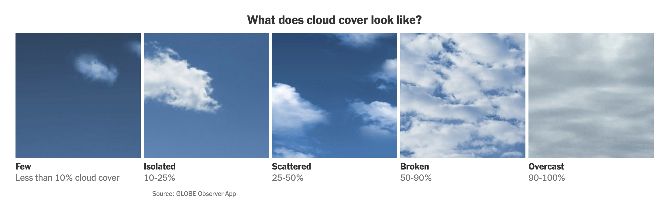
This legend encapsulates "show, don't tell". I expected to find it on the dynamic map. It is one of those informative legends that not just describes a classification scheme but conveys even more information to the reader.
Alas, that was not to be. The actual legend looks like this:
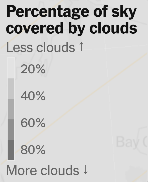
The plain-English legend labels of "Less clouds", "More clouds" work well. I'd prefer to use the same grouping of <10%, 1-25%, 25-50%, 50-90% and 90-100%. Presumably, those bins are chosen to align with human perception.
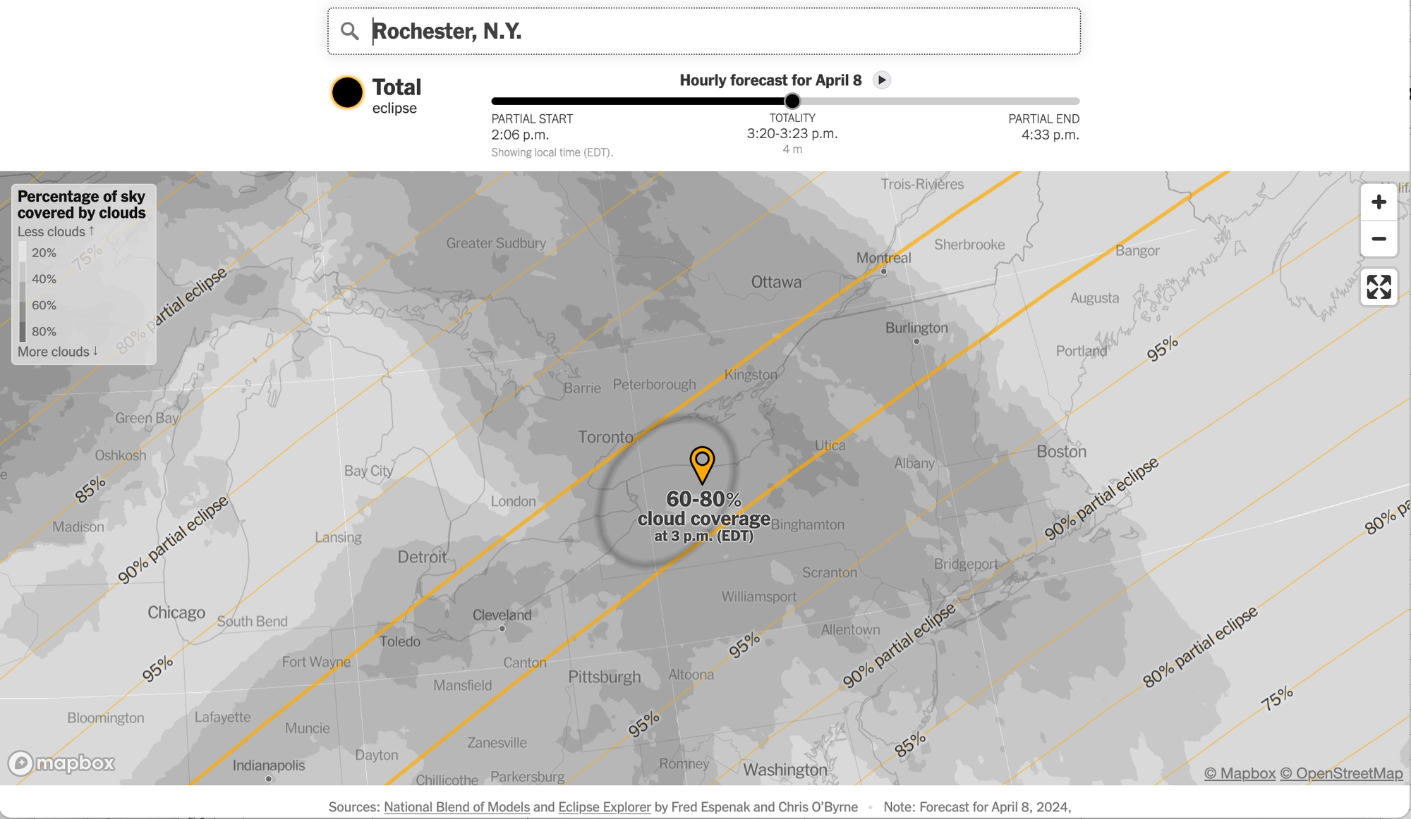
The following screenshot shows the view from Montreal.
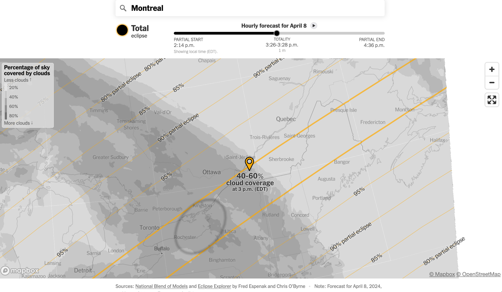
Notice where the moon's shadow is relative to the slider's position. I believe they are showing the same standard time window for all locations (expressed in local time). As a result, at any location, much of the slider is nonfunctional - for those periods, the shadow is far away, and off the page.
Instead, an optimal viewing window can be established for each location, and the slider's labels customized to indicate it.
Elsewhere in the article (link), they also show another slightly different design that replaces forecasted cloud cover with historical data.
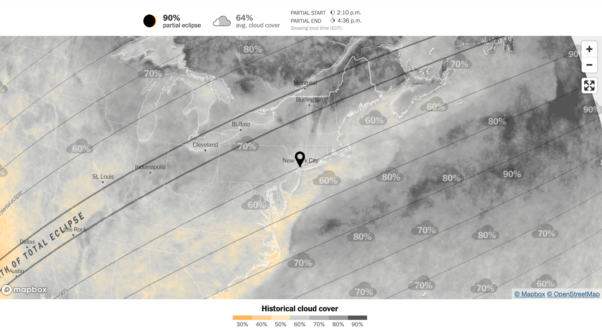
I suppose they produced it prior to when the latest forecasts became available. In reality, the real-time element is more decorative than substantive: the reason I say this is that any predictive model of cloud cover must be based on historical data!
I prefer this two-color legend to the grayscale above. The yellow parts stand out as locations where people have great visibility for the full solar eclipse. Through this, you can clearly see why a static map like this one has limits - the yellow visibility may not be there when the moon's shadow passes by, and on a static map, you can't show different places at different times.


